Changing your mind: can you bear to paint over it? Thursday, Oct 6 2011 

Firstly, I realise I have been a ‘bad blogger’ and vanished for a large period of time.  This is because I’ve got a proper job again (Marketing Director for another global firm) which has fairly much eaten up my life.  The good part of that is an influx of funds, and also new ideas as I’m exposed to new environments (hotels, offices, overseas travel) and new ways of doing things.

Of course, this means that some things I’ve already done, I rethink.

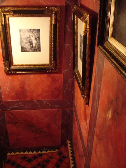
This for example:

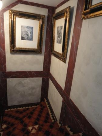
It’s very dramatic and glowing.  But I felt in the mood for something more conservative (maybe I’m wearing a suit too much?) and restrained.  So, to the horror of the man, I just set to and painted over it without a second thought.

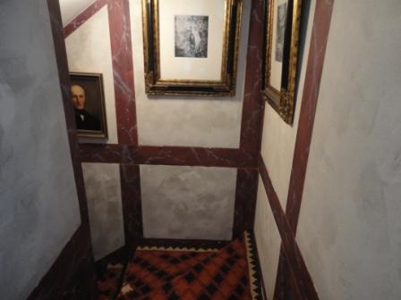
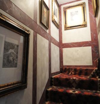
Somehow, a couple of years after I’ve completed the original project, I lose all attachment and am willing to obliterate my original efforts.  in this instance, I wanted to keep the panelling effect to enliven the featureless stairwell, but I wanted to tone down the red.

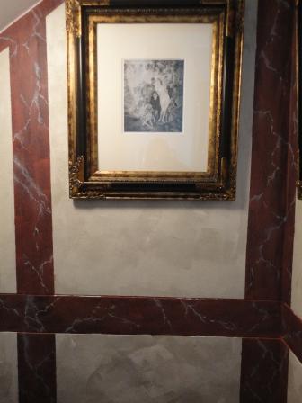
It took me about an hour to mask off the darker bands.  And another hours to roller on a faux stone effect.  I used household emulsion paint in two colours – a mid grey and an offwhite.  I poured half and half into a roller tray, and ensuring I dipped the roller the same way each time, I rolled it on using random and rough strokes.

The secret is to be bold, don’t go over the area too many times or it will blend into nothingness.  Have a brush handy to blend into the corners.  And ensure that you don’t get lines from the edge of the roller.  So, after two hours in total, my former travails were hidden and transformed into a new look.

It’s interesting how different it looks isn’t it?  The borders now appear burgundy, not blackish (see my post here on colour relativity theory!).  It appears much more classical and far less funky.  The panelling effect really breaks up the walls and adds interest to what would otherwise be a very functional and dark stair way.

Do you like it?  Or did you prefer the wild wonders of the red marble??

Before and after: a bathroom ripped out and rebuilt Friday, Mar 4 2011 

All my dreaming has not been in vain – I have redone a number of bathrooms.  None quite so fantastical as my last post, but definitely rewarding.

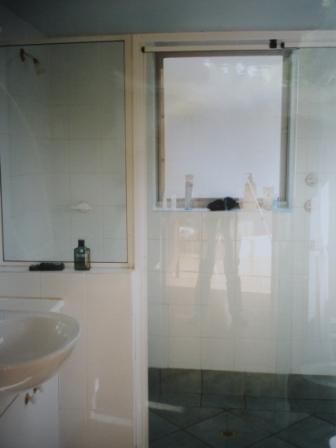
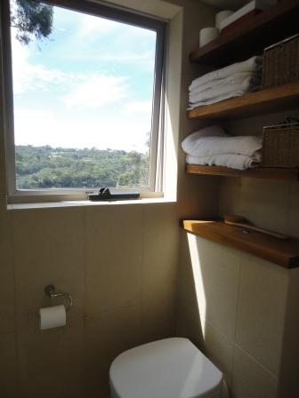
This is an en suite off a master bedroom.  It had been divided in two by a low brick wall, with a double shower taking up the further half of the room (seen above).  The tiles were very dated and all the finishes were cheap white plastic.  Yuk!

I was intrigued about the double shower.  It brought to mind communal bathing after football matches, or inmates forced to shower together.  I can’t imagine a situation where I’d be in such a rush that I’d have to shower simultaneously with my beloved.  Or a situation where, if I wanted to shower WITH him, I’d want to be three metres away in my own space. 

Anyone?

So that was knocked down!

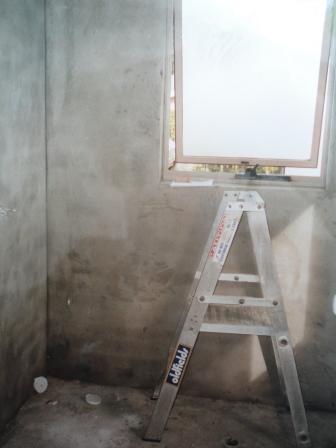
The whole room was stripped back (above), waterproofed and we started again.  You have to be pretty brave to live through this.  The dust that is generated by jackhammering out tiles, cutting and relaying them defies belief.  You find it for years afterwards, however carefully you clean up.

bathroom after twin sinks basins gilt mirrors wood floating shelf

Despite my derogatory comments on double showers in the home, some things are nice ‘double’ – and I think basins are one of those.  Basins take heavy use at both ends of the day, and this way, each gets to have his or her own, with their own clobber around it (tidied away for this photo).

Although this bathroom was done six years ago, it still looks current. 

Bathrooms can be brought alive by contrast in texture: here largely between wood and tile and glass.  A floating shelf supports two sculptural basins in perfect symmetry.  The basins are not ceramic (and terribly fragile, as the plumber first feared) but enamelled steel – hence their super slim delicate shapes.

Sleek wastes take the water away elegantly into the wall.  Doesn’t it look amazing with no pipes, and no support?

The mirrors aren’t your usual bathroom bland, but a pair of vintage gilt frames that really add the wow factor.

Doing away with a vanity makes a small bathroom look far bigger (storage issues were solved below).

bathroom after toilet storage wood floating shelf

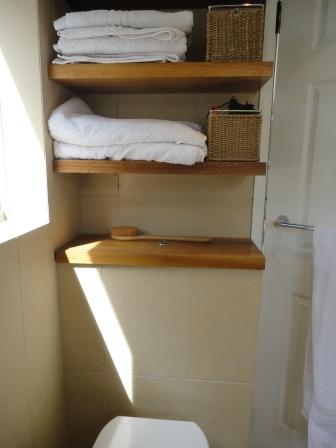
The toilet had its cistern hidden, and aligned with that, more floating wood shelves line the wall above for storage.  A great place to keep clean towels, toilet rolls, and other goodies hidden in baskets.

bathroom after wood floating shelf basin sink

A Bedouin antique grinder sits in the corner – the only ornamentation in a room designed to be light, easy and refreshing first thing in the morning.

Remember the ‘before’ photo?

Here is that same view ‘after’.  As the room is fairly small (about 3m by 3m), a simple tile ensures it isn’t overwhelmed.  These were laid vertically to emphasise height.  The matching tile, but square, were used for the floor.

Square, tiled, drains were used in the shower – far nicer than plug holes.

bathroom after frameless shower

The stunning view was left unencumbered by blinds or frosted windows.  The only creatures that can see in are the birds.

bathroom after toilet floating wood shelves storage view

It’s a lovely sunny space to shower in.

An entryway before and after Monday, Feb 28 2011 

A redesign of the front of the house (by previous owners) resulted in a very strange entryway here:

hall entryway before interiors

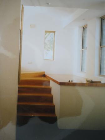
A large concrete platform, topped with wood, filled the space.  This was the architect’s idea – I’m not sure of the purpose.  The floor was tiled in black slate – a completely different material to that used anywhere else in the house: wood stairs lead upwards to a wooden floor.  Pale tiles lead off to the other living area.

All in all, it wasn’t really working.  There was nowhere to put anything on arriving home, and no space in which to greet guests.

hall entryway before interiors stairs

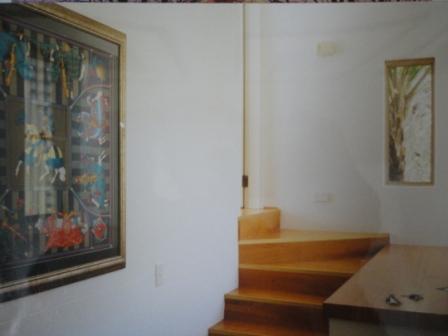
This called for some structural work.  The concrete platform was demolished and removed.  The floor and stairs were re-tiled to match the other living areas in a lovely pale travertine tile.  These tiles are not real travertine, which is porous and stains, but a fabulous ceramic imitation. 

The photo below is the ‘after’ of the first photo….

hall entryway after interiors travertine tiles

When thinking of your hall or entry to your house, these are the things you might need:

1. A place to put ‘stuff’ when you get home.  This can vary from small items like keys – where I recommend an elegant solution like this.  You may also need space for coats, shoes, hats, umbrellas.

shelves entryway hall foyer

2. When you walk into your home (or anyone else’s) you want to feel welcomed.  One of the best ways to do this is to have the hall as a mini version of the rest of the house.  If your house is all in pinks and flowers – ensure the entry has that in abundance.  If you’re mad keen on taxidermy – include them on arrival.  Too many of us leave the good stuff for the other rooms – whereas you walk in the door every day – and need to see something stunning.  It also sets the scene for the rest of the home.

leather books gilt embossed pearl inlay

3. Make sure your acoustics are good.  In this hallway, it meant hanging a tapestry on the wall as there wasn’t enough room for a rug to blunt the sound.  Arriving into an echoing space is too much like entering a gallery.  Your ears will not tell you it’s homely.

antique tapestry travertine tiles

4. If you have the space, a seat on which to sit and put on shoes is ideal.  There isn’t space here so the stairs suffice.  One consideration was to put a seat at the far end of the shelves – but it just felt too inaccessible.

entryway hall interior antique tapestry travertine tiles

This area really reflects both the house and the owners.  Books, eclectic ‘objets’, harmonious colours…

front door hallway entry

So just once again: Before:

hall entryway before interiors

And after:

hall entryway after interiors travertine tiles

 Before:

hall entryway before interiors stairs

and after:

antique tapestry travertine tiles

Personalised Presents: the ultimate in luxury gifts Monday, Feb 21 2011 

personalised gifts initialed box interiors gilt writing

It’s so hard to buy presents these days.  We all have everything we could wish for.  When we want something – we just go out and buy it. 

So, what do you get a close friend for a special birthday?

Personalised gifts are the new ‘in’ thing.  These can be things you have commissioned someone else to personalise: linens embroidered with initials, stationery and so on.  Or, it can be something you’ve made.

When my close friend Ben had a significant birthday recently, I spent several happy hours creating something just for him.  A lot more fun than spending several desperate hours traipsing round a shopping mall…

Old filing box vintage before

Remember these boxes?  I bought several at a sale and have already altered two here and here.

personalised gifts initialed box interiors gilt interior

This time I painted the interior gold.  Once that was dry, I prepped the outside and used a spray enamel paint in a lovely masculine Burgundy colour.  I love how smart it looks suddenly.

Then, to make it specially for Ben, I designed a flouncy letter ‘B’ (not that Ben is flouncy) and stencilled that onto the lid.

personalised gifts initialed box interiors gilt interior

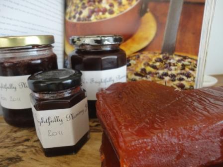
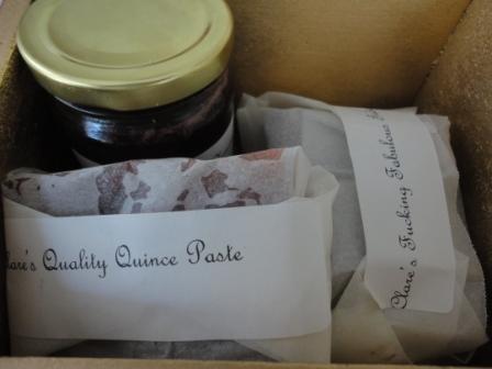
Of course, you should never give an empty box.  So I set about making some delicious goodies to go inside.  I already had Quince Paste that I had made, so I wrapped this carefully.  To add to the fun, I decided to label everything as though it was from a speciality store (old marketing habits die hard).  So the paste was labelled “Clare’s Quality Quince Paste”.

homemade gifts personalised jam quince paste

Plums are just coming into season, so I made jam: Clare’s Frightfully Plummy Jam.  (to be read in a frightfully plummy English accent).

homemade gifts personalised jam quince paste

And then to top it off, I made Fudge.  This is one of those things that I love making, and that I’ve made so often that I’ve become proficient.  I always take a big box to my family where it is consumed in record time.

I made chocolate and walnut fudge and labelled it Clare’s Fabulous Fudge.  Actually, there was another adjective there, but for those of you with a more sensitive disposition, I leave you to work it out yourselves from the photo.  Because the fudge really is that fabulous.

homemade gifts personalised jam quince paste fudge

I would never have had the luxury of so much time in my role as Head of Marketing.  What a delight it is to be able to give that to a dear friend.

homemade gifts personalised jam quince paste fudge box gilt

I’ll show you how to make the fudge later in the week.  Although don’t read it unless you’re prepared to eat a lot of fudge in a short space of time.  It is very hard to be strong-willed around it…..

Indoor-outdoor living: veranda before and after Monday, Feb 7 2011 

Veranda before

Sometimes I look at the before photos of the house (see above) and wonder that I purchased it!   This ‘lean-to’ was painted Mission Brown (remember the 1970’s??).  The brick of the house was unattractive.  It had few saving graces.

I did get the house rendered professionally (by an amazing Croatian family – who did an amazing job).  Then I set to on the paintwork myself.  What a difference a coat of white paint makes.  I chose Winter White in an outdoor paint formulated to withstand the Australian sun (after shown below).

White painted veranda after

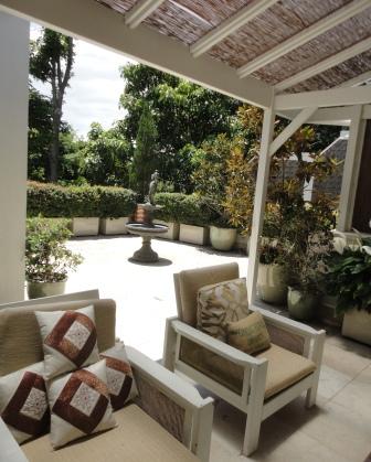
The tiles were replaced, as I mention here.  The leaning brush was taken down and nature reed used to cover the lattice both for privacy, and for a more up-to-date look.  Here is another ‘before’ below.

Inside veranda before

This is the exact same view after.  Can you believe it?

Veranda indoor outdoor living

The chairs are the same.  I just painted them white and recovered the cushions.

day bed outdoor living veranda design interiors

I made the day bed myself.  That’s something for another post. 

You can see more on the outdoor patio area makeover here – but just a reminder of this view before…

roof garden patio before

…and after….

veranda with view to patio

I planted lilies all along behind the day bed to break it all up with greenery.  These Madonna Lilies are renowned for their ability to purify the air.  Not that we have much issue with that – but it’s nice to know!  They love it here – lots of light but no direct sun.

Day bed veranda indoor outdoor living design

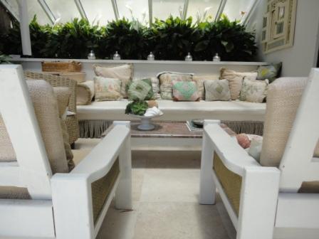
I really wanted this to feel like a proper room, so I have used all the things that I’d put in a sitting room.  Whilst it is exposed, it doesn’t get direct weather.  So I chose to use indoor fabrics (not weather proof ones) as I like the feel of real velvet, and real linen. 

Day bed veranda indoor seating outdoor living design

Loads of cushions make it feel luxurious and relaxed.  I’ve kept the base colour scheme neutral so that if I feel like a change, all I need do is alter the cushion covers.

Salvaged mantlepiece: create a fireplace focal point Friday, Jan 21 2011 

mantlepiece interior renovation

Maybe you’ve got a fireplace and you’re thinking about changing it?  Or maybe (like me) you have a room without a focal point, and you’ve decided that a fireplace is the answer.

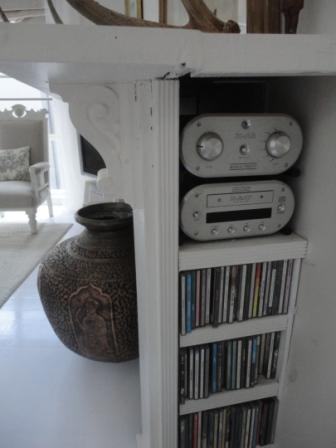
I’ve covered the new fireplace briefly in the sitting-room makeover, but this fireplace has a secret.  It isn’t real.  It houses the stereo and the CDs. 

(I realise that CDs are a soon to be outdated technology, but I’m sure I’ll find another use for the storage then.  Books perhaps?)

stripped mantlepiece

Firstly, you can buy the wood surrounds new.  However, for less than 10% of the price, you can buy one from a salvage yard.  It’s a bit more work, but worth it.  This one I stripped using a heat gun.  You can read how addicted I got to that blistering and peeling paint (SO SO satisfying) just from the application of a very hot hairdryer here.

You can see it above when I was propping it up, working it all out.

I did like the look of it stripped, but I needed to build it in, and I just couldn’t get wood to match and look seamless unless I painted it white again.

Also – the corbels were white plaster (as you can see) and I thought they looked a little odd.

build fireplace mantel mantlepiece white wood

I propped the wood fire surround about a foot out from the wall.  I used another piece of wood the same thickness, and screwed that on, to extend the top to the wall.  Some builders bog filled in any gaps between the two.

Then I built plywood sides so that it started to look like a proper fireplace.  These are now painted grey (above) – as the inside of a fire is darker.

hidden shelves fireplace mantlepiece whiteThen I built shelves in behind.  one massive one ran the length of the mantlepiece, forming both the shelf for the stereo, and also the top of the firebox to be painted grey.  Beneath that I build individual shelves just wide enough to hold CDs.  I trimmed them with beading to make them look beautiful.

fireplace wood white mantel storage stereo CDs interiors

If you look carefully in the photo above you can see the join between the mantle surround and the extra wood I attached to extend it to the wall.  Admittedly a professional could do better, but no-one has ever noticed – or at least been rude enough to comment!

 white mantlepiece fireplace after

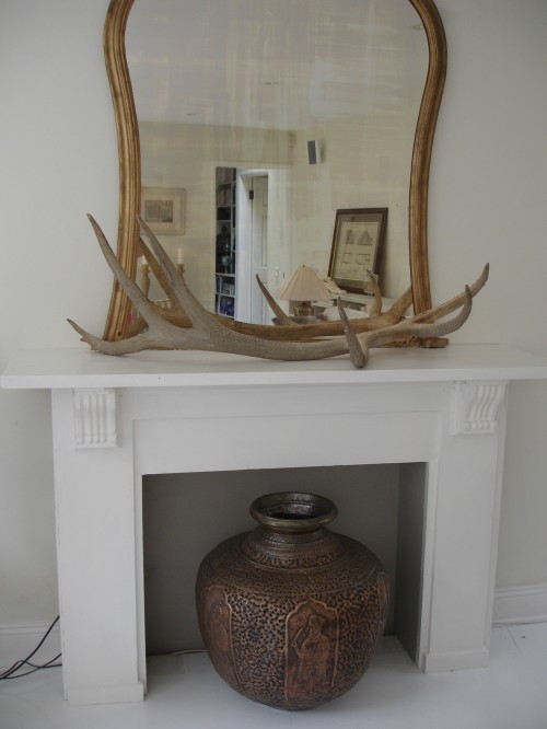
The room not only has a focal point, it has now has storage for the stereo and CDs – all hidden from view.

Nifty?

Until someone tries to light a fire and our stereo goes up in smoke….

fireplace wood white mantel storage stereo CDs interiors

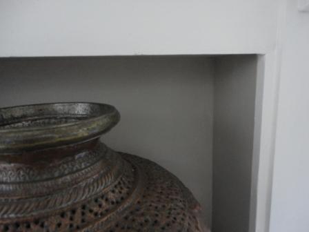
The other secret of a good-looking fireplace is not to leave it empty.  This wonderful copper urn (secondhand of course!) fills it beautifully.  And the Elk Antler (obviously secondhand – the Elk had it first) adds interest to the top.

If you notice, there is also a tiny carved figure from Papua New Guinea – I love the way she stands guard there.

Have you found a great way to conceal storage?

Patio and roof garden design: before and after Friday, Jan 14 2011 

roof garden patio before

This was the patio as it was when I bought this house…. I called it my prison exercise yard.  It was a square of ugly brick walls, with pink tiles.  There was so much not to like.  The 2cm of thick grey grout between each tile.  The flesh pink of the tiles themselves, that clashed with the yellow-grey brick.  A selection of half-dead plants and disused furniture cluttered the area.

veranda before

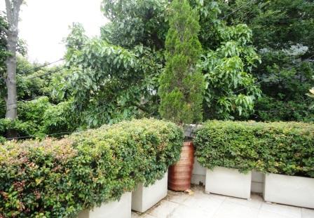
This has been one of the most rewarding projects.  I had the walls rendered to cover the brick, and eventually I paved over the old tiles with a fake travertine ceramic (real travertine picks up mould and dirt as it is porous).

I then set about designing a planting scheme.  Here is what I learned along the way:
veranda after

In a small area, stick to two or three plants only.   Any more and it looks cluttered and messy.  I put Lilly Pilly (an Australian native that is very similar to European Box) hedges around the edge and used Magnolia Little Gem and Junipers as accent plants.

Verandah roof terrace after interiors design patio

As a focal point in the centre I bought an old bronze water feature, with a double fountain.  I don’t have this wired up, but the rain keeps it full (and when necessary I top it up).  My gorgeous cat is fascinated!

bronze statue little boy water carrier patio garden design

I planted a pot of gardenia in the corner as I can’t resist their heavenly perfume.  But overall, I wanted a French Formal garden look, so I kept flowers to a minimum, (and only white ones), and went for geometric shapes and hedging (structure) rather than wild planting.  In a small area I felt anything else would be overwhelming.
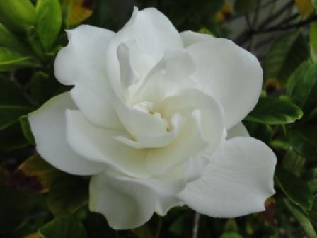
white gardenia flower

I selected plants that are evergreen (easy in Australia) as I want this to look verdant all year round as I see it from the kitchen and dining areas.

potted magolia little gem patio design

I sought advice from a horticulturist on which plants would do best in this environment.  Having spent the first 30 years of my life in England, I’m no expert on Australian plants (although I am improving).  Plants can be expensive and I didn’t want them dying on me!

Bronze statue Verandah roof terrace after interiors design patio

To make it feel more like a garden (and less like a concrete patio) I hid the walls by planting hedges in front of them.  Initially I was concerned that this might make the area feel smaller, as I was losing about 60cm all around the perimeter.  but just as moving your furniture away from the walls doesn’t make your room feel smaller, so this just made the area feel more garden-like.

As this is actually a garden built on the roof of the living room below, the only soil is that in planters and pots.  Size matters here.  Go as large as you can for the benefit of the plant…
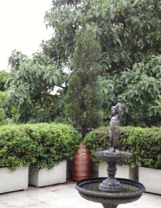
Bronze statue Verandah roof terrace after interiors design patio2

I bought the plants from a wholesale nursery, which was about a third of the price of retail.  You can’t pick out your own plants, but I was prepared to sacrifice that for the financial savings I was making.
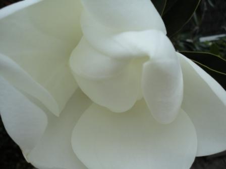
White magnolia flower

The water feature attracts lots of native birds.  This is a gorgeous Galah.  And this is why the cats are always on their hind legs – drinking very the water that the birds have bathed in?  What could be more delicious?!
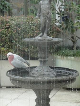
galah bird bath fountain roof garden patio design

Here is another ‘before’ shot, from above.  I didn’t change the lattice work, which gives privacy around the edge of the roof garden, and would have been pricey.  It was very sturdy and in good condition.  Instead I covered it with nature-reed.  I think this looks a little more modern and interesting.  I also considered growing creepers or vines over it, but this fitted with my simple, formal scheme best.

patio before from above

I used large planters.  Fewer large pots look much better than lots of little ones (which I had before).  The larger the pot, the happier the plant – it doesn’t dry out so easily, it has more soil and nutrients and can grow more healthily.  

It also works to keep to one pot design.  Lots of different ones again look messy and cluttered.  I used different pots for my focal plants, and otherwise kept to a neutral vanilla ceramic euro-trough.   This was a big lesson for me.  Few pots, all of the same type, are what you need for visual impact!

roof garden patio design lilli pilli

This last photo is a tantalising glimpse of the indoor-outdoor living area I created.  I’ll post before and after photos of that shortly.  I was aiming for  Hamptons-style area in which to relax, but on a non-existent budget.
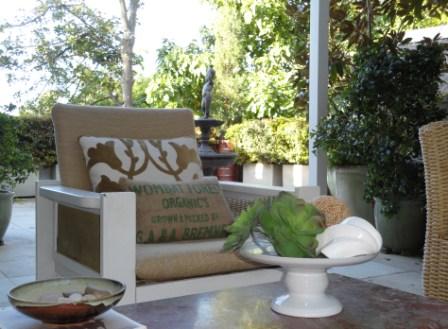
verandah roof garden patio garden design

How to make a gorgeous vintage map box (before and after) Wednesday, Jan 5 2011 

I think I mentioned that I got a load of old filing boxes from a deceased estate.  I crackled glazed the first one (here), and have been thinking about the next project.

My post on maps decided me – it had to be….

Old filing box vintage before

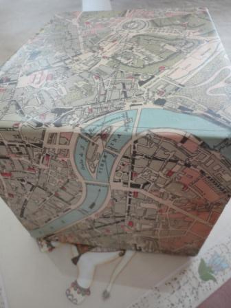
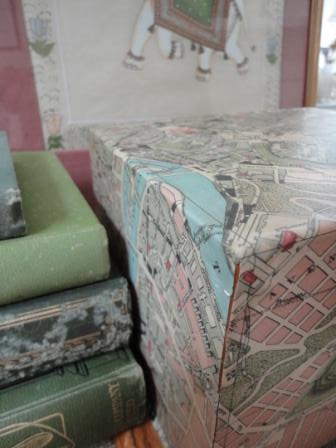
I cleaned the old labels off and gave this a bit of a scrub.  And then I got to work on this divine wrapping paper I found!  It has an old map of Rome printed on it – but the paper itself is high quality and robust.  I’m sure you could use an actual map – but this beautiful paper just spoke to me.

map covered Old filing box vintage before

I made sure that the nicest bit was on the lid (in this case I wanted the Colosseum, and the Forum).  Whilst you could cut each side separately, I wanted the box to look seamless, so I wrapped the paper round and cut a cross shape to fit the top and all sides.

map covered box recycled vintage

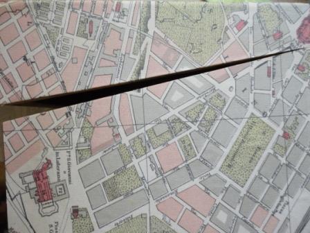
I painted PVA glue evening onto each surface, starting with the top, and smoothed the paper over it.  As I covered each edge, I used a scalpel to cut the map where the top and the bottom join – as you can see below.

map covered box recycled vintage interiors2

This way the map will be continuous and the join between the lid and the base will be invisible.

I also cut around the hinges.  I did think about taking them off and re-attaching them – but I thought this would be easier and neater.  Again I used a scalpel, cutting the hole once the top was glued but before gluing the back, so that it would sit completely flat.

map hinges covered box recycled vintage interiors

They are rather cute brass hinges, so I don’t mind seeing them.  Then I waited (impatiently) for the glue to dry.  Whilst you can leave it unvarnished – it will get torn and dirty with time.  I thought I’d take a leaf out of the decoupage book – and varnish the paper.  By the way – I just don’t get the appeal of decoupage – it always looks chintzy and frilly to me – cut-outs of flowers glued onto wood.  Why would you?

varnishing map decoupage covered box recycled vintage interiors

I wasn’t quite sure how the varnish was going to take to the paper.  (sometimes glue or varnish can react badly with the printing and make it run).  I suppose if I were a different kind of person I would have done a test.  But as I only had $6 invested in the paper, I thought I’d live dangerously…  If it didn’t work, I could start again.

Luckily it did work.  And three coats of varnish later it looks amazing!  I used wood varnish in a satin finish.

recovered vintage map box interiors recycled

The varnish really makes it tough.  Dirt and oil from fingers won’t mark it.  Dust won’t permanently settle into the paper.

recovered vintage map box interiors recycled2

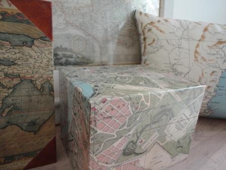
Wrapping the paper seamlessly over the top and sides creates a sense of flow over the box and allows you to find your way through parts of Rome…

recovered vintage map box interiors recycled3

The colours in this go with so many decor styles and colour schemes.

recovered vintage map box interiors recycled books

And for total maptastic overload….

recovered vintage map box interiors recycled books

mmm – time to plan the next holiday I think…..

recovered vintage map box interiors recycled books3

Please can you vote on what I should do with this table? Sunday, Dec 19 2010 

This is one project I want to finish off over the holidays.  I’m toying with a couple of options – and your opinion would be appreciated.

I started off with this:

coffee table before recycling

I wanted a large, low coffee table.  (Ideally, a coffee table should be lower than the height of the seat.)  I really don’t like the marmalade varnish that is often used on pine.  Pine is such a lovely colour until it is turned orange.

It’s like a really bad fake tan.

sanded prepped pine coffee table before

I sanded it back hard, to really rough up the varnish.  And then I primed it:

Primed white coffee table wood

And then while I thought about it, I put a matt white first coat of paint on, to even it all up and provide a base for the next step:

Primed painted white coffee table wood

The only problem is, I can’t quite decide what the next step is!

These are the kinds of ideas that I was considering.  I’m into flags at the moment, as you’ll know from this box I did earlier….

So I was considering a flag on the table, but in monochrome creams and greys.  I was actually wondering about the US flag this time though.

The one above is subtle, but might look nice?

Or maybe an off-set flag?

And then I wondered if that would be all too much, and that just a distressed effect might be better

So I actually haven’t done anything at all!

Please can you vote – and I’ll follow your advice.  The finished project to be seen in early January.

New use for old books (and a cute gift idea) Wednesday, Dec 15 2010 

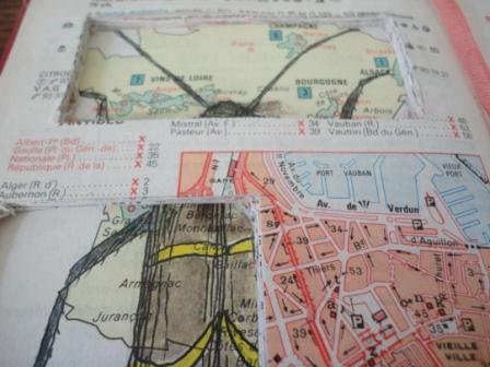
Do you live with someone who just can’t throw stuff out?  Or are YOU that person?  Sometimes loved ones have items that they inexplicably cling to – things that appear to be precious for no apparent reason, and that grow into piles of hoarded ‘stuff’.  As you’ve guessed from that comment, I’m not a hoarder.  In reality, neither is ‘the man’ – but he has insisted on keeping the 1989 Michelin Guide on our shelves, despite the fact that most of the places mentioned have either shut down or been replaced by motorways.

What better project for a cute little refurbishment?

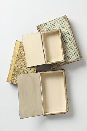
I had always had a love of those stories where treasures were hidden in books, secreted in holes cut into the pages, so this spurred my ideas.  In fact, Anthropologie are charging a few hundred dollars for something similar:

I wanted to created something more fun, arty and personal than useful.  (I’m still considering doing another book the Anthropology way – but that might be for next year).

secret hole cut into book vintage interior

I divided the book into two, keeping the majority of the pages to the back, and then I painted PVA glue throughout the edges of the pages to glue and bind them together.  This took quite a bit of time and patience.  I painted several layers until the back pages were almost lacquered like a box.

secret hole cut into book vintage interior

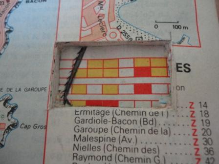
Then I used a scalpel to cut through the pages, until I had created a box within the book.  I kept going until I had an interesting page for the base of the cavity.  This is hard work.  I actually got a blister on my finger from doing this.

secret hole cut into book vintage interior beetle

Then I painted two little beetles and stuck them on pins inside the cavity.  A bit like Victorian specimen cabinets.  And a bit like beetles eating old books and wood.

And then I protected it all by gluing acetate onto the top (I just used an old overhead projector piece of acetate!)

secret hole cut into book vintage interior beetle

On the opposite page, I painted a large beetle onto a page, and then glued the pages together on top.  And I cut three holes until I revealed parts of this huge, painted insect.

insect hole cut into book vintage interior beetle

I know you’re wondering why I’m obsessed with beetles – but actually, it was a bit of a joke, for ‘the man’ to enjoy – as I had found a pile of sawdust as large as my fist on my desk – which we created from an antique altar table…. (remember?).  This kind of freaked me out.  I then found several HUGE beetles in the room and discovered to my horror that they were top of Australia’s most wanted list.  (totally freaked now)

beetle book art holes cut in books vintage recycled interiors

Aww – look at its leg!  Is this too creepy for you?  Well – I called Quarantine and they were over in a flash and wrapped the whole desk in clingfilm (yup – that’s how high-tech we are over here) and took the beetle away for analysis.  Apparently it was very exciting as the beetles were very lively (usually they only get dead ones).  Later they picked up the desk and stuck it in a freezer at -27C for two weeks, and then brought it back.

And it was all FREE!  Sometimes, I’m glad I pay taxes.  (not very often, admittedly, but I may as well be thankful on those rare occasions).

Anyway – hence the joke of the beetles.  And the actual Asian Longhorn beetle that was in our desk – is the one painted on the left.

beetle book art holes cut in books vintage  interiors

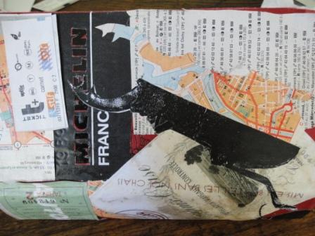
After all THAT – I did the cover.  I kept some of the title, and then added all kind of personal stuff like metro tickets from our trip to France, photos, labels from great French wine we’d drunk and so on.  I photocopied these so I didn’t have to spoil the originals.

beetle book holes cut in books vintage recycled interiors

All this resulted in a very personal and unique ‘objet’ – with memories galore.

Michelin france book art

Was ‘the man’ thrilled at this wonderful creation from his treasured book?  Well – after a few whiskies he was reconciled to the idea….

secret hole cut into book vintage interior

Next Page »