Inspirations from Abroad (Part One) Tuesday, May 25 2010 

Wandering round Osterley Park, I longed for a return to the days of craftsmenship and detailing.  Every surface had been treated to some kind of gilding, painting, carving or adornment.  Fabulous rooms opened up, one after another.  Not necessarily over-the-top, but creative and expressive in a way that seems to have been lost.

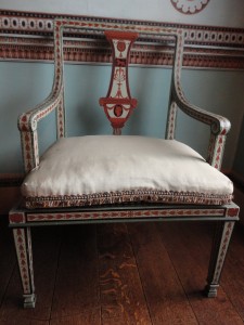
This painted chair looks elegant against its painted backdrop – and yet doesn’t overpower.  I love the restrained colours – the pale eggshell background with burnt sienna designs.

I became fascinated with the panelling.  Some was painted and gilded with wonderful effect:

Doors were decorated with neoclassical references that just look amazing.

How contemporary these things could look in the right room today.  I can’t wait to try them out!

New use for old scientific scales Thursday, May 20 2010 

I came across some old scientific scales at a deceased estate auction a few months back.  Not that I needed scales that would measure tiny grams – it was the box that caught my eye.  It went for a song, as who uses these old things now?

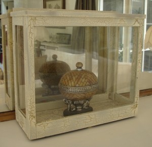
crackle glazed case

I sanded back the wood and applied a crackalure glaze to it so that it looks old and interesting.  Then I lined the floor with an old map – I liked the way that the patterns and colouring of the map seemed to mirror the crackling of the glaze.

I love things like this as they can really make a display, or create a focal point.  This one could work well for shells and coral:

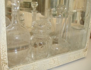
A collection of Victorian and vintage decanters and glassware would also look great pulled together in a neat little cabinet like this, the glass of the cabinet echoing its contents:

glassware in a recycled glass display

The foot stool part two Thursday, May 13 2010 

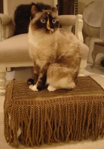
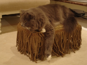
Cat on foot stool part twoIt seems my other cat (Porridge) got jealous as soon as she found out Diesel was on my blog.

So she immediately posed for a photo – and here she is.  This stool is SO much more popular with the fringe!

How to tell if your refurbished piece has worked Thursday, May 13 2010 

Sometimes you might wonder whether your revamped furniture is a success?  Does it really look better?  Will anyone like it?

I find there is an easy way to tell (well, if you have pets).

Cat on foot stool

“This old thing? I’ve had it for ages…”  Diesel (cat) definitely approves of this one….

It’s actually an existing (refurbished, of course!)  footstool for which I made a ‘winter coat’.  The white wood and silk velvet felt a little too beachy as the nights draw in.

Silk foot stool

So I made a little cover for it out of a remnant of silk and some leftover bullion trim.  Its new incarnation definitely won Diesel’s immediate approval.  Having ignored the stool for the past year, he made a beeline for it and claimed it.  I guess then, I can call this one a success….

Hope he’s not too disappointed when it transforms back in summer.

Murals, Stenciling and Trompe L’oeil Saturday, May 8 2010 

Painting pictures on your walls is such a forbidden delight.  I have such strong memories of parental wrath at the very idea of taking pen or crayon to a wall or furniture, that murals for me, hold an extra thrill.  Not only can you create something truly unique for your home.  You can also mess with those old parental messages.  Even now, the first brush stroke on a pristine wall feels naughty….

Which of course, is part of the fun.

Murals and stencils can look tacky.  Be warned.  And be prepared to paint over them if you don’t like them.  If I start with this in mind, things usually work out OK.

Stencils can look particularly home-grown unless they are either for children (see the tiger below in progress, who was an illustration of Tyger Tyger burning bright) or in an old house where they are a good replica of period decor.  Greek revival, art deco, these are the themes that respond well to stencils.

Tiger stencil for a child

Murals work best if they are rarely seen – a room that is used occasionally or perhaps only glimpsed, otherwise they have a tendency to grow tiresome.  I really enjoy trompe l’oeil, as I love that momentary deception, that first double take.

Here, the wall of a dull, rendered balcony was brought to life with fake sandstone blocks, and a fake niche filled with leather volumes.  This witty addition transformed a dull area into somewhere fun to sit.

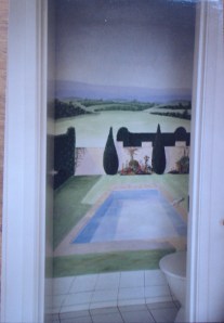
Trompe L'oeil mural in a toilet

This mural is in a downstairs bathroom.  When the door is shut, there are no windows and no features.  At first glance, it appears as though the room is opening onto a garden.  Even when the illusion has faded, the mural means that the space doesn’t feel closed in or windowless.

The tiles are continued into the mural to blur the edges of reality.  The owner’s cat can be seen just peeking into the pool.

As this room is rarely used, it is a fun way to liven it up.  Such a mural in a main living area would soon lose its effect.

Total Room Makeover: Sitting room Thursday, May 6 2010 

Wow – this room had some issues.  Firstly, it wasn’t a regular shape: the far wall was angled so that one side wall was longer than the other, destroying symmetry and giving a slightly weird feel to the room.  Then, to compound this, there was no focal point: no fireplace, no view, nothing on which to centre the room.  The ceilings were not soaring – at 2.4m they were the minimum legal height in Australia, and the fact that the windows stopped well short of the ceiling meant that the room felt squashed downwards.  The floor was cheap timber veneer, and a strange zig-zag brick wall separated the stairs.

This was a huge project.

Sitting room before

Rather than replace the floor, which would be costly, and wasteful of resources, the decision was made to paint it.  Painted floors have been around for centuries in Europe and can add a fabulous dimension to a room.  Using gloss white paint means that light is reflected back up, reducing the slightly oppressive feel of the ceiling, and creating a vibrant quality of light that really lifts the whole room.

Then a major decision was made to address the partial wall dividing the stairs.  This stopped light coming down, and although it doesn’t look so bad in this photo, actually was a rather ugly lump of brick.

Sitting room stairs before

The wall was partially demolished first.  Rather than remove it completely, partial removal would allow the existing stairs to be made wider, and thereby more graceful.

Here you can see that the stairs had also been made using the timber veneer and that rather unattractive metal plates had been put on their edges.  Fine for commercial application, but a little heavy-handed for domestic.

The stairs were replaced with recycled wood from a bridge girder, complete with all the wear, tear and bolt holes.

Here you can start to see the effects of just replacing the stairs and painting the floor.  The lack of architectural features, also meant that while the floor was being painted, we replaced the 3mm wood around the edge with proper skirting boards.

The question of the focal point was addressed with a false fireplace.  Putting in a gas fire was considered, but as this home already has ducted heating, it wasn’t considered a worthwhile spend.  An old mantlepiece was recycled – this represented a considerable cost saving as new ones cost $1500 to $2000, and this was picked up for $200.  It required stripping and repainting, but all round, a better solution.

The mantle was built in to conceal the stereo and CD collection, so it also performs a function.  The inside was painted darker so that it was more convincing as a fireplace.

The mantlepiece was painted to match the floor.  The mirror on top creates the illusion of height by extending the full distance to the ceiling.  This is an old mirror that has been recycled – it’s silvering is beautifully antiqued so that is reflects a softer version of the room.

The poorly shaped windows and low ceiling were further disguised by blinds that cover the gap between the top of the window and the ceiling, giving the impression that the windows continue beyond the blinds.  Vertical lines and the impression of height were created with elegant, generous curtains.  These were made from end-of-line fabric remnants from top designers which meant that a lower cost was paid for exquisite fabric.

Some ‘new’ furnishings were selected – from reclaimed sources… A linen and wood trunk forms a coffee table and good storage beside the sofa.  Two vintage lamps frame the ends of the lounge and provide task lighting for reading.

Strong symmetry was created around the focal fireplace to counteract the angled back wall: a pair of large pictures frame it either side.  Furniture was set in a U-shape so that conversation is comfortable.  The television was offset, so that it can be seen, but doesn’t dominate the room.

Every view of the room was designed to look appealing and welcoming.  Walking in from the corridor, you are greeted by an glimpse of a space with personality that invites further exploration.  The positioning of a tiny vintage leather suitcase breaks up what might have been too much white.

Every seat has access to a table, but also to books or items of interest.  This room is designed so that you want to spend time there.

An old foot stool was covered in luxurious silk and used as a side table, piled with inviting books.  An old pine chest was repurposed as another table, the various elements linked through a uniting colour scheme and intricate, geometric surface designs.

The most expensive part of this makeover was the stairs.  Otherwise, costs were minimal.  Recycled material were used almost exclusively, and some things were saved (like the floor) rather than being thrown out and replaced.

Displaying ornaments and arranging shelves Saturday, May 1 2010 

I love being able to make a room look fabulous in an hour, without even buying anything.   The thing that often lets room or a space down is the clutter or ‘stuff’ that gets in the way of seeing it clearly.  Most of us have way too much stuff.  Gifts.  Things we bought on holiday.  Things we’ve had for years, and by virtue of that fact alone now class as ‘sentimental’.  Things that may be ‘valuable’ in terms of monetary value, but that we might not even like them very much.  And all of these things accumulate in our homes.

Editing and arranging display professionally can give a room an instant lift, like a hair cut.

 All that needs changed is the display and arrangements of possessions. 

Edited and arranged shelving

Unifying objects by colour, or shape or style is a good way to go.  If you have a lot of books, again, sort them by colour or size.  Sounds mad?  A librarian from a University library actually told me that most people come in and ask for ‘the large red book on…’ – so it’s not such a crazy way of sorting them (despite initial sceptism from some quarters!)

Carefully arrangement objets

Items usually look good grouped together rather than on their own – when they can look consigned to solitary confinement.  For reasons I can’t explain, odd numbered grouping look best of all (three items look better than two or four).  Here four carved tobacco holders, two bone snuff bottles and a chinese stone weight work together as they are all linked by their intricate carved designs.

Beautifully styled shelves

A picture or artwork over a display helps anchor it.