Organic recycled End-of-bed Bench Wednesday, Jul 28 2010 

I’m really excited about this project – converting a somewhat dilapidated bench into the ultimate in organic chic….

Here it is ‘before’.  The padding and the fabric had pretty much disintegrated.

Bench before

The first thing to do is strip it right back.  As I took the fabric off, it became apparent that all the padding underneath was absolutely shot.  (revolting actually!)

Recycling furniture

So I took it right back to its bare bones – which are very beautiful.

Stool ready to be reupholstered

Then I needed to prepare some more padding.   In a stool like this, horsehair was the old-fashioned filling.  I’m not really a purist (in case you haven’t guessed) so I’m happy to use modern technology where it suits – and high quality foam inserts work beautifully here.

The tricky part is actually cutting this stuff.  The best way I’ve found is to use an electric carving knife!  Most places that you buy this will cut it to size – but I have a stash of it, so needed to cut it myself.  I wanted to make this a more luxurious piece, so I used a thicker foam than was in the original (about three times times thicker!).

Cutting furniture foam

This is then placed on the stool, and wadding added to soften the edges.  Usually you’d put a calico cover on, but I prefer to use up material left over from previous projects (re-use etc) so this lucky stool got it’s ‘calico’ coat made out of beautiful gold stripe!

Partly reupholstered bench

Putting this layer on will make the top fabric sit much better.  Although when I went to find what I wanted to use, I thought – maybe I’d better come back later?

Cat on recycled fabric

Then I remembered it is ‘Let sleeping DOGS lie’ and it doesn’t say anything about cats….  Poor Diesel.

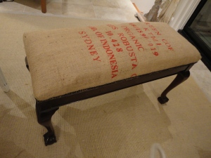
A carefully sourced vintage (organic!) coffee sack is to be the final cover.  I’m sure I’m just going to love the texture of the bag against the smooth polished mahogany of the antique legs.  Incidentally – don’t you just love those ball and claw feet?  (the stool – not the cat!)

Organic coffee stool

The edges were trimmed with studs to finish it off.

Recycled reupholstered bench

With this type of very thick fabric, the only way to get the corners really crisp is to hand sew them. It’s worth it – they sit much better for some stitching.

recycled end of bed stool

This stool has a storage compartment inside – the lid lifts up on hinges – which makes it even more handy.doesnt cost the earth bench stool

This item will be for sale, when I get around to that.

Do send in before and after photos of your recycled furniture – and share your experiences.

How to: make your house look like it’s from a magazine Monday, Jul 26 2010 

When you look at photos of beautiful houses in magazines and on web sites, over half the photos are of close-ups of display.  It’s actually very hard to get a room looking great from all angles, and few photographers ever show the reality of these rooms.  The secret lies in the styling.

Most people have their ornaments, pictures, flowers etc spread evenly throughout the house.  This is the styling equivalent of putting eyeshadow and lipstick evenly all over your face.  It’s kind of missing the point.  These things need to be group in strong areas of focus.  This is what makes your lips and eyes stand out on your face. And this is what can make a stand out room.

I was with a client on Saturday and we spent a couple of hours doing just this, and transformed her living and dining rooms without spending a penny.  So here’s roughly how you do it.

Take the image below….

Doesnt cost the earth to style

It doesn’t look too bad?  Well – it’s nowhere near magazine quality.  Firstly, group things by colour.  Pick a colour (or two) from the room, and hunt through your house for items with that colour in.  Our eyes see colour before anything else, so it’s the easiest way to make something look ‘done’.

Make sure you include some largish hard back books.  Lay these on their side, in graduating size order to form a pyramid.  Now pop something on the top – a box (smaller again), a paperweight, whatever looks good to you.  You can actually include several of these piles actually (you’ll notice they are in all magazine photos).

Now prop up a couple of smallish pictures or mirrors behind to create a  back drop.  Try and unify them with colours again.  Slightly overlap the frames if you’re using more than one.

Now include a vase or something with height.  Put this towards the middle of the display to creat height.  Again, look for a pyramid effect with the display higher in the centre.

Low cost interiors: restyle your home

As this is quite a big surface, more than one colour is used, but all the greens are largely grouped on the left.  Gold and black are accents.  This is also reasonably practical as displays go as it includes the perfume etc that was already here to be used.

Beautiful homes on a budget

If you’re doing something with shelves (rather than a table top) make sure you put larger items lower, so it doesn’t look top heavy.  Stylists often use rustic baskets or piles of books.  I think if you’ve used books above it can look monotonous to use them below too.  Here, two throw pillows from the bed are piled up –  a useful place to store them, and visually pleasing.  You could also fold up a blanket or throw from the bed or sofa here.

The colours pull together the look.  If it were in a magazine, there would be flowers in the vase – but we’re doing this on a zero budget here.  A spray of leaves from the garden might suffice.

Mini-styling

Even if it’s a tiny table, a book and box on top can make it look ‘meant’ – especially when it picks up the colours of the room.

If you want help getting started, I do ‘lessons’ in your home – usually two hours is all it takes.  You can even invite friends (and share the cost) so you can all learn, and then put it into practice yourselves.  Alternatively, I can work with you to completely re-style and ‘shop’ your home – so that your interior doesn’t cost the earth.

Magic Mushrooms and a luscious laundry Thursday, Jul 22 2010 

Laundry waiting to be renovatedThis laundry was UGLY!  White tiles, chipped in places.

Laundry before

Firstly I replaced the sink and cabinet (with IKEA – good quality and reasonably priced) – and extended the bench along the full length.  (Had to replace the washing machine – but front loaders can be very eco-friendly and water efficient).

New sink and benchtop

Then there were the tiles…  Every time I thought of hacking them all off, the dust, the work, the debris…. I got cold sweats.  (I have tried to do this before, and ended up with cuts from flying tiles.  It’s not for the faint hearted).  So I resolved to cover them up.

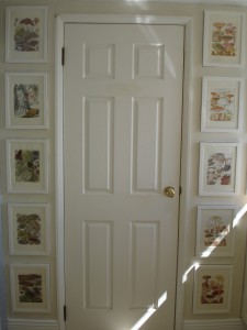
I’d been dying to trying a panelling effect with pictures, so this seemed the perfect place.  I had a book on Fungi and Mushrooms from when I was a teenager, and had a craze on them.  I cut out the colour plates, and framed them all.   Then, I covered the tiles with 3mm plywood, cutting out holes for the framed mushrooms.  I then stuck these into the ready-made slots.  I wanted it to look as though the whole wall was panelled, and I wanted no reminant of the tiles.

Laundry after

I had to do lots of calculations to adjust the picture size so that I could get the spacing and sizing the same all round the room (maths was useful for something after all!).

Laundry door

I love this room now!  It’s one of my absolute favourites.

Completed laundry

Feature on Apartment Therapy Wednesday, Jul 21 2010 

I’m so thrilled so be on Apartment Therapy.  The people who have led the way in world-wide interior blogs…

http://www.apartmenttherapy.com/la/house-tours/claires-sydney-second-hand-house-call-122453

Dressing up a dressing room Tuesday, Jul 20 2010 

Dressing room beforeThis walk in wardrobe has shelves and hanging space on two walls.  On the third, is a (cheap looking) mirror, some switches and a niche in the wall.  This wall really lets down the smart finish of the actual shelving.  In addition, this area serves two people.  More space and better light would be ideal.

Walk in robe before

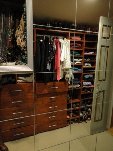
This little space was begging to be covering in mirrors – to visually double the space, to bounce back more light, and to allow both occupants to see their outfits simultaneously.  As the shape of the room, the niches etc made it complex, mirror tiles were the cost-effective and easy solution.

The first tiles go on

Here you can see the first few tiles going on.  It’s important to use a spirit level to get these straight.  It also helps to measure and plan where the tiles are going, and the best place to start laying them.  From then on, it’s pretty straight-forward.

Walk in robe after

The strip behind the door went in smoothly.  Doesn’t it look so much more polished and sophisticated?  The onsite inspection was rigorous…. Diesel posted himself neatly where he could survey the handywork.

Cat inspects workmanship

The niche in the wall needs a frame to neaten it up – easy enough with a drop saw and some beading…

Dressing room almost complete

But the switches still need moving the make it possible to install the final few tiles.  The effect is already apparent.  The whole space feels much more vibrant, light and large. 

Mirrored dressing room after

The grid lines in the mirror don’t really break up the reflection, but they do echo the grid of the shelving and drawers in a pleasing way.

Heavy baronial chairs get a Scandinavian make-over Thursday, Jul 15 2010 

There is a real trend at the moment for pale furniture, upholstered in natural linen.  But some of these pieces come with an astronomical price tag.  And it also means that all those darker, heavier pieces are left, unloved, out in the cold.  Or out by the road side…  And really, it’s just a case of cosmetics.  Much of the darker wood furniture has beautiful bones and just needs a fresh look in order to be desirable again.

These two baronial chairs were two such pieces.

Baronial chairs before

The wood is dark and carved, and the dark tapestry upholstery is very dated.  however, they are very well-made, expensive (originally) piece of furniture and have lots of life left in them.

I stripped back the upholstery and recovered them in a natural linen, with a stone colour trim.  Then I stripped back the varnished wood and painted it chalk white, picking out some of the detailing in the carving in a deeper colour.

re-upholstered baronial chairs

The look of these chairs can be changed quite dramatically with a different cushion and a new setting.  For winter they look sumptuous with a silk velvet cushion and full dark curtains behind.  Whereas they work equally well in a summery-look room, with a white painted floor and a beaded linen cushion.

Detailing

Baronial chair after

These gorgeous chairs could have had a range of treatments: black gloss paint with red leather upholstery would have created an exotic oriental look; stripped back wood with a chintz and you’ve got a lovely English country look.  For the time being, they can live in a Scandinavian costume…. until next time.

Neil’s rescued Charles Eames (reproduction) chair Monday, Jul 12 2010 

Neil's world cup chairNeil in London says:

“My weekend involved the mending of a Charles Eames reproduction lounger. I picked it up from a neighbour for nothing who was taking it to the dump. I now have a perfect lounger and ottoman for the princely sum of £2.99 (cost of bolts from Homebase) and 2 hours work. You can probably tell I’m quite pleased with myself.
It was a relatively simple re-attach of the back to the seat using bolts which you can barely see at all.  It’s a pleasure to sit in knowing it cost so little and has come in extremely handy for World Cup watching.

Neil's Charles Eames chair

Magic with Mirrors Wednesday, Jul 7 2010 

I love mirrors!   This has nothing to do with narcissism (Narcissus, who fell in love with his own reflection in a pool, not realising this was but an image of himself, could not tear himself away – and gazed unmoving at his beauteous image until he faded and died!)

No – I love the way a mirror can bring light into a dark corner, can play tricks on the eye, can visually extend space where there isn’t any.  And carefully placed, you need not be disturbed by never-ending reflections of yourself.

Here, a mirror has been placed on a sliding door into a garage.  The garage door opened immediately to the left of the front door, along with a staircase heading down and a passageway to the right.  The space felt compromised by so many doorways and openings.  Covering the door with a mirror doubled the space visually making it feel more welcoming.  It also enhanced the light so that the hallway feels well-lit and bright.  Finally, it provides a convenient place to check ones appearence before heading out.  It was a very easy solution, as the sliding door and door frame already existed, framing the mirror beautifully.

Mirror on garage door

Mirrors behind shelves can add space and vibrancy to storage.  Glass jars in a kitchen are backed by a mirror that makes the alcove look larger and offers glimpses of the garden outside.  Mirrors and glass often complement each other and usually a successful match.

Mirror behind storage jars

This can work in an alcove too.  Putting a mirror in an alcove immediately brings light into what will naturally be a darker part of the room.  It can also offer different views and perspectives on the room and be used to reflect an attractive aspect.  Here, a stunning antique gold screen is visible in the mirror.  Mahogany shelves in front of the mirror prevent it dominating.

Mirror in alcove

The strong vertical lines of the mirror add height to a room that needs help in this respect.  The panelled frame of the mirror adds architectural interest which is again, lacking in the room, and creates an exotic note that works well with the screen.

Mirror reflecting screen

Most houses already have a number of mirrors.  Usually, there are mirrors above handbasins in bathrooms – but all too often, these are terribly functional.  This is a great opportunity to add some real character and panache to a room!

Below, a pair of ornate, vintage mirrors offset two very modern, sculptural basins on a simple wooden shelf.  The juxtaposition of the clean lines with the ornate frames sets each off beautifully.  A plain unframed mirror may have led to a more sterile feel to the bathroom.

Pair of ornate bathroom mirrors

In this unlikely pairing, a very simple wall-mounted basin is topped with an antique mirror, studded with tiny ceramic medallions, mounted in brass and each hand painted with an individual scene.  Most bathrooms, these days, are well ventilated and therefore don’t need specially manufactured frames that can withstand very damp environments. 

Antique mirror over modern basin

Finally, another mirror in a bathroom at the end of a corridor.  A carefully placed long mirror casts back an image of the passage, making it look as though it doesn’t end, and teasing you with an entry into another world.

Alice through the Looking Glass, eat your heart out.

Mirror reflecting a corridor