Tiles for a bathroom: the good, the bad and the ugly Monday, Mar 7 2011 

Tiles are expensive, and a major part of the cost of a bathroom.  And nowadays they come in seemingly infinite variations.  So where do you start?

This is what I’ve picked up:

1. The smaller the room, the simpler the tile.  If your space is small, stick to a larger, plainer tile.  Don’t mix up patterns and so on – it’ll be too busy.  Avoid mosaics, as all that grout makes it quite overwhelming in a small space.

The mosaics below are a much less soothing look and together with the stripe overwhelm the small area…

2. In a larger space, you can use tiles to define areas – such as the bath, or the shower.  This can look stylish.  Keeping the colour palette very similar ensures that it looks great. 

3. Borders and feature tiles are likely to look dated over time.  See below.  I’d really avoid these unless you can’t live without them.

4. Grout is important.  Thick lines of grout are very passé.  It used to be 2-3cm thick, whereas tiles now need to be laid very close to each other, with a similar colour grout to make it all look seamless.  Your tiler should also align grout lines along the floor and wall so that the lines are continuous.

5. Laying tiles diagonally across a space is also very out-of-date.  Stick to lines of tile that follow the line of the walls.  It was thought that diagonal lines of tiles make the room look bigger, but they just look old-fashioned.  Likewise border tiles around the edge of the floor.  These are definitely not the ‘in’ thing right now.

6. If you want the look of natural stone there are lots of fabulous ceramic imitation that have random stone patterns (so no two are the same), and don’t need sealing to prevent staining and mould (which many natural stone tiles require).

These days you don’t have to spend a lot of money to get a sophisticated surface.

7. If you have a lot of  ‘corners’ in your tiles, ensure that the tile is tough enough to be mitred.  This gives a sleek edge where it meets.  But if the tile isn’t a high quality hard tile, the corners will chip and it’ll look terrible.

Your tiler should be mitring the corners, and not laying one tile flat, and the other perpendicular, so that you see the edge of one tile…..  These are the key to a professional finish.

8. Take out a few bricks in the wall to create an alcove to store product (very useful in the shower).  You can then highlight this with different tiles inside the alcove.

9. Finally – make it your own.  I just adore the way that tiles have been used to create architecture (below) – faux tile panelling.  What a fabulous idea…

The glimmer of gold below is so glamorous.  I love metallics in a bathroom – you’re not in there long enough for it to be too too much.

Fantastical bathrooms: dream while you bathe Wednesday, Mar 2 2011 

One of my favourite ways to relax after a long day is in a hot bath, ideally with a glass of whisky, or a cup of tea (depending on my mood).  The physical immersion into warm silky water is an automatic switch for my brain.  Bliss.

The ultimate relaxation, in my dream life where I’m wealthy and waited-on, would be to bathe in one of these stunning bathrooms.  Why not use them as inspiration for yours?

Blue, a traditional favourite in the bathroom, due to its associations with water, is given a new lease of life – as the colour of the bath itself, and on a wonderful mural-type arrangement of tiles.  Is that the Spanish Armada approaching??

Below, polished plaster, the colour of cocoa, is glossed into a luxurious finish.  It’s a small room, but it still feels elegant due to the limited colour palette and expensive accessories.  With a good artisan, polishing plaster or concrete can be an economical alternative to tiles.  Definitely worth considering….

A double marble sink feels weightless without a heavy vanity beneath.  Do you really need everything that you have in yours?

Bathing becomes part of the bedtime routine with a bath behind the bed.  But would you want your bedroom becoming steamy (metaphorically might be OK – but literally?)

This metallic tub (below) reflects back the light into the small space, making it feel more welcoming.

This solution is taken to the max with a mirror-sided bath (below).  This is a fabulous idea that means you don’t need panels or tiles on the side of the bath.  And it will make the room feel so much larger and lighter.  Another plus is that the only part of you reflected back is your slender ankles.

This can be done to a vanity too.  You can easily do this yourself with mirrors cut to size.  What a fun way to enliven a bathroom!

Forget the need for floor-to-ceiling tiles.  Wood panelling looks dramatic and romantic.  I’d throw a couple of armchairs in this room too, to make it feel more furnished (and less as though matron is going to appear and give you a good scrubbing).

All the extras can be fun – this is a free-standing tap and spout.

Or for a touch of the Versace – a lion’s head spout.  Utterly over-the-top luxury!

If you want something alternative – how about the hand-crafted wooden bath below?  It’s a lot more comfortable than the usual wooden tubs that are square and based on Japanese baths.

If you’re inspired, Drummonds is the high-end supplier of many of these looks.  Check out their ads (below).  Now I want to do a massive bird mural above my bath!  That would drive the cats wild….

Mood boards: what is your interior decor style? Wednesday, Feb 9 2011 

Much of a home’s impact comes from the mood it creates – in the same way that a theatre backdrop sets the scene for the play.  Our minds are built around associations so that beach themes are attractive because they remind us of holidays, relaxation and escapism.  Large loft-style living with industrial accessories make us think of cool, edgy and hip.

Different styles and looks appeal to different people.  I drew up some mood boards to help friends and clients decide on what they were really trying to create in their homes. 

Which one are you?

tropical caribbean decor interior style mood board

Tropical Caribbean Mood Board

The Tropical look is based around colour – bright and vibrant colour and lots of it.  Mango, emerald, Indigo, Fuchsia, turquoise and Acid yellow all zing in this style.  This is about pattern, and multiple combined patterns.  Flowers, fruit and birds proliferate.  Plants feature inside and out and accents in raffia, natural woods and woven furniture.

This is about being over the top.  And if you like this, it’s unlikely that you’re the shy and retiring type.  You’re probably as loud, cheerful and sociable as the picture above.

This look is not compatible with urban living or very citified environments.  It works best with open spaces that lead onto gardens.

Gilt-edged glamour decor interior style mood board

Gilt-edged Glamour Mood Board

Full blown glamour is a luxurious style  with lots of gold and gilt.  Colours are deeper: amber, oyster, forest green, midnight blue and violet.  This is about lots of sparkle – mirrors and glass, marble and travertine. The baroque, rococo and empire styles of history have strong influence here.

Furniture is likely to be antique or carved.  Fabrics will be rich: silk velvet, satins and brocades. 

This looks is not compatible with chrome and modern finishes.

Masculine club decor interior style mood board

Masculine Club Mood Board

The Masculine Club style relies on a sombre colour palate of charcoal, navy and grey.  There is lots of leather (sofas and even floors), wool and flannel.  Wood is dark and usually polished – this is a formal aesthetic, with occasional lapses into a collector’s study.

Include a car with drinks, bottles, and mirrors.  Throw in some leather-bound books.  Keep the lines straight, trims to a minimum and you’ll have the musky, hushed cigar-smoke atmosphere of a gentleman’s club or library.

This looks doesn’t go with frills and flounces, pastel colours or pinks!

Industrial loft decor interior style mood board

Industrial Loft Mood Board

The Industrial Loft is a rough-edged look with structure and pipes showing.  This is no time to hide the plumbing.  Rust, iron, brickwork and concrete form a key part of the style.

Flags, banners and repurposed objects feature heavily.  It works best in lofts and warehouse conversions.

This is not compatible with three pieces suites or matching sets of furniture. 

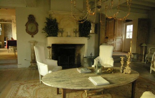
Eclectic rustic decor interior style mood board french provincial

Rustic Provencal Mood Board

This is an eclectic look – part rustic, part french provincial, part Tuscan.  Colours are faded or neutral shades of aqua, sage, lavender, pearl and oatmeal.

Textures are rich and layered with wood, coral, rustic stone, worn leather and fossils.  Linens and silks cover furniture and if patterned will be very faded and worn.

There is plenty of room for collected items (the more the better) adding to the overall sense of history and faded grandeur.  Wood is limed or distressed.

This isn’t compatible with chrome, bright and clear colours or artificial fibres (such as polyester).
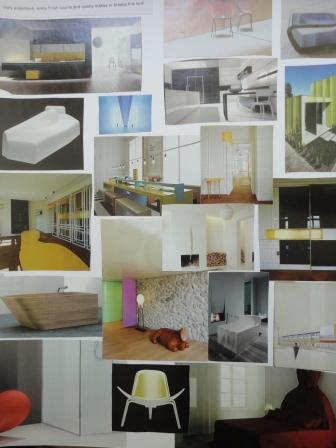
Minimalist modernist avant garde decor interior style mood board

Minimalist Modernist Avant Garde Mood Board

If your style is minimal and avant-garde, then really I have no idea why you are reading my blog!  This is incredibly expensive to create.  it relies on perfect finish, slick clean lines and strong linear shapes or sculptural pieces.

Colours are pure white or black, with bright clear flashes of colour.  Surfaces are glossy: chrome, steel, plastic.  Storage is hidden and furniture is spare.

This doesn’t really go with antiques, pattern, clutter mess or dirt.

This looks is made by its quality and its upkeep.  If you like this – you gotta be rich.
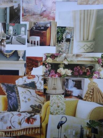
English manor house decor interior style mood board

English Manor House Mood Board

The English Country Manor: florals, chintzes and patterns are layered with luxurious fabrics.  There are abundant rugs, trims, tassels and fringes.  Colours are natural but bright: leaf green, coral, butter yellow.  Polished rosewood and mahogany hold photos in silver frames.

It’s elegant, it’s classic, it’s classy.

Smart contemporary decor interior style mood board

Smart Contemporary Mood Board

The Smart Contemporary style is reminiscent of a luxury city hotel: colour schemes are simple taupes, wines and chocolate.  It is tailored, clean and formal.  Fabrics are leather, chrome and chenille.

This is generally a style that doesn’t display a lot of personality.  It is not compatible with mess or clutter, or with many personal touches. 

Fresh Country decor interior style mood board

Fresh Country Mood Board

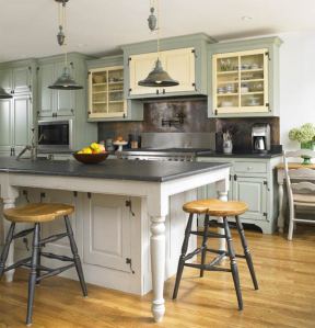
The fresh country style has lots of wood and white with a single colour such as azure blue, rose-pink or apple green.

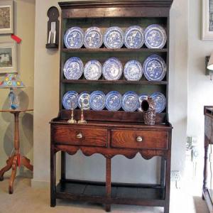
Antiques and vintage furniture sit on wooden floorboards with toile-de-jouy, striped or checked cotton and linen fabrics.  Willow pattern china or old dinner services sit on a dresser, with bowls of flowers, samplers and family treasures.

Atlantic Style decor interior style mood board

Atlantic Style Mood Board

Atlantic style is about wood-boarded walls, canvas and linen.  Pale colours such as chalk, grey and duck-egg blue summon memories of the blustery atlantic coast.  Nautical references abound.  Furniture is distressed and fabrics are sunbleached, with driftwood, sisal rugs, storm lanterns.

Wool throws and blankets keep it cosy.

This isn’t compatible with lots of colour or pattern – it relies on a very pared back colour scheme.

So…. which one are you?  Or are you a combination of one or two?  More than three and you’re confused – and if you’re having trouble decorating your house this is why!

Getting a gourmet kitchen on a tight budget Wednesday, Jan 26 2011 

kitchen interior recycled

Kitchens can be SO expensive.  And SO gorgeous.  How do you get gorgeous on a budget?

I often see images (whether of interiors or clothes or gardens) that I covet, and then mull for weeks over how to create that look affordably.  The design-work is the part that makes it look amazing – so if you have a clear design that you love, imitating can be a lot less expensive than paying for the creation of something new.

kitchen interior recycled

Firstly (I love this bit) do your homework – look at lots of picture and cut out all the photos of kitchens you like.  (Not out of library books – out of magazines.)  Gathering all your photos and images together, work out the common themes.  This will help you work out what you like.  Is it a colour?  The flagstone floor?  Do you like the antique pot racks with copper saucepans hanging down?  Or do you prefer glass cabinets?  Or wood?

Getting this clear in your head at the start save expensive mistakes later on….

kitchen interior recycled

Then have a good honest look at your current kitchen.  Is the layout working?  If so, it might be possible to leave the cabinets and either paint or change the doors.  This is a great solution as it is inexpensive and environmentally friendly.  If you’re going to attempt to paint the doors yourself, take them off and paint them elsewhere.  This way, you’ll be able to get to the bits inside the hinges and so on, without making a mess in your kitchen.

small galley kitchen white

Ensure you use durable paint (you don’t want it chipping off).  And make sure you sand and prepare well – for the same reason.

If you are painting them yourself, you could consider a different colour for the inside of cupboard doors – as inspired by Scott Weston here.

If not, you’ll have to pull it all out.

Firstly – don’t chuck the old kitchen.  You may well find a taker on eBay who is prepared to dismantle and take away your old kitchen for re-use.  I gave mine to a home for small children – they came and took it and used it.  I was so thrilled!

kitchen before renovation

I changed mine for a number of reasons:

1. The left hand wall (you can’t quite see in the photo) was floor-to-ceiling cupboards with no bench space.  You can see, above, the other bench space.  Basically there wasn’t any!  And I love to cook.

2. The veneer on the cupboards was very old, very dated.  It was starting to peel and to turn a strange pinkish shade.

3. The pink splodgy marble bench top was about the most hideous thing I could imagine.

But I still lived with it for three years!  (yup – that’s the before and after – above and below…)

kitchen renovation after white Ikea wood benchtop

I changed the design so that the bench extended all round the edge.  This greatly improved the kitchen’s usability.  And I re-did the whole thing for less than $8,000.

How?

1. If your appliances (oven, dishwasher etc) are working fine, then keep them.  This will save you thousands.  Most appliances these days last at least a decade.

2. Custom-made kitchens are the most expensive.  And having your own cupboards built will not make them more durable in any way.  Almost 15 years ago I saw the most amazing kitchen I’d ever seen in an architect’s home in London, so I now always buy the brand he recommended. His kitchen was the ultimate in chic and desirability.  I couldn’t quite believe it when he said… IKEA. 

Yup!  I know.  Hard to believe. 

But in actual fact, more time is spent on the design, more rigour is put into the durability, and it has more flexibility than most other kitchens.  They have a 10 year guarantee against paint chipping etc!

 kitchen renovation after white Ikea wood benchtop window

3. Consider wood for the bench top.  I actually love the look of wooden bench tops, but they are also hugely practical.  They don’t require large amounts of marble to be mined and transported.  They can be fitted immediately (unlike man-made stone which has to be moulded to size over several weeks).  A monthly oil (with linseed oil) keeps them fresh and water-tight.  And if anything terrible happens you can always sand them back.

I’ve had mine installed for 4 years, and the wood is as good as new.  Wood also has anti-bacterial properties, which makes it a hygienic choice too.

kitchen renovation after white Ikea wood benchtop chopping board

4. Have it professionally fitted.  I got a fabulous carpenter to install this kitchen as he can make it look far more professional than I ever could.  He actually cut the bench tops to fit into the glass bricks (before there was a separate sill there – this solution not only look better, it bought me more bench top).

kitchen renovation after white Ikea wood benchtop glass bricks

5. Install your upper cabinets up to ceiling height (look at the divine kitchen below – I love how they’ve done it there).  This does a number of things: firstly it prevents dust and dirt congregating on top of the cabinets.  Secondly, it gives you the wonderful vertical lines and height I talked about with curtains.  And finally, it will look far more finished and elegant.  They don’t have to be real cabinets that function – just the doors cut to size will work perfectly.

high ceiling kitchen white cabinet interiors

Make sure you build in niches and space for things YOU use.  I wanted a shelf for cookbooks, room for glass jars… so I included them in the design.

To break up the look, I used glass-fronted cabinets above.  This also had the effect of making the glass bricks look ‘meant’ (rather than just dated).

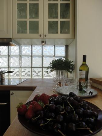
kitchen renovation after white Ikea wood benchtop glass bricks cherries

I changed the lighting too and installed lights under the cabinets above the bench – which is the spot you want brightly lit.

I’m lucky to have a lovely view out of the kitchen – so I made sure this was as uncluttered as possible.

kitchen renovation after white Ikea wood benchtop window

Things to avoid:

1. If you choose a strong colour for the cabinets, it is likely to look dated over time.  If you want a strong colour, why not use it on the walls?  (I have also heard at least one terrible story of the strong colour for the upper cabinets not matching exactly the colour on the lower ones.  Ouch!)

2. Don’t use marble or granite for bench tops unless you are fully aware of the drawbacks of porous stone.  Beetroot and red wine will stain these.

3. Splashback fashion changes.  Stainless steel is looking very last millennium.  Go for something timeless – simple tiles or even untinted glass (which is what I chose – although most of mine are glass brick).

4.  Open shelves are very fashionable – but you may regret it.  Kitchens generate huge amounts of dirt from cooking and open shelves (and their contents) will quickly become dirty.

Above all, think about how you will use it.  And if you don’t cook – don’t get a fancy kitchen!  Spend your money where you’ll appreciate it.

Gosh, my posts are getting long aren’t they?  Too much to talk about!

How to get the Industrial Rock’n’Roll look Monday, Dec 13 2010 

Are you the coolest person you know?  Then you’re probably already living with this style.

I love the edginess and vibrancy of rock’n’roll and industrial interiors.  They always seem to belong to the hip party girl (or dude).  There are some tricks to creating this look in your home.  It generally works best in a warehouse or loft conversion, but it can be translated into various interiors with a lot of punchy impact.  And the great thing is – recycled objects are the key to rocking this look.

Add bricks

Exposed brickwork really adds some grit (literally!) to this look.  The contrast between the rough brick and the smooth fabric is what makes it work.

Exposed pipework

You don’t want to look as though you tried too hard –  I mean you’re too busy to care whether or not you see the plumbing.  Let it all hang out.  Pipework, brickwork, airconditioning ducts and anything structural – if it’s usually hidden, this look has it all out on display.

I’m not sure whether this is the design equivalent of celebrities without underwear?

Unfinished surfaces

This look has wood and other surfaces that aren’t slick and finished.  Don’t worry if paint is peeling – it all adds character.

Contrasting Sleek

Despite all the rough and unkempt surfaces, remember you are a rock chick.  You’re rich, right?  So you need some very beautiful and sleek pieces for contrast.  The concrete prevents the pink chaise from look girly.  And the pink elegance makes the concrete look chosen (rather than unfinished and cheap).

Industrial accessories

Industrial accessories make you look cool because you recognise the beauty even in the rough.  And you recycle!

Add a flag (or two!)

Flags are an essential part of industrial and rock decor.  They can appear as rugs, hung on walls or covering sofas.  Just never on a flag pole.

Toys

Just to show you’re still a child at heart, make sure some really expensive toys are on show – whether it is a motorbike, a guitar or a recording studio.  You know how to play, and your tastes are expensive!

Unusual Accessories

A floating bed?  A door fit for a barn?  Throw it into the mix and you’ll have the kind of home that rock stars dream of.

How to get that French provincial country look Wednesday, Nov 24 2010 

You can spend hours trawling through photos of a ‘look’ you love, and still not quite know the best way to achieve it.

This series of posts cuts out the work for you, and breaks it down into the elements you want.

 The French provincial look is hot right now.  And no wonder – it looks relaxed and welcoming.  It feels as though families have lived there for generations, laying down memories, reading books in the shade, eating on the terrace beneath ancient vines: an idyllic contrast to our stressed and technological lifestyle.

Here are some easy ways to get that look in your own home.

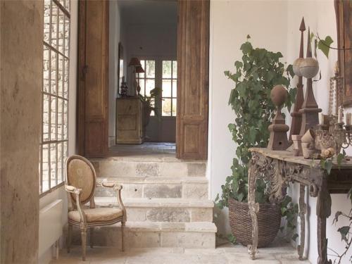
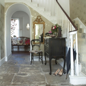
Flagstones

Flagstone floors conjure up images of fairytale cottages, of boots piling the entry of manor houses, of a life lived outdoors. 

Using these on your floors can hark back to times gone by – just make sure they look slightly worn.

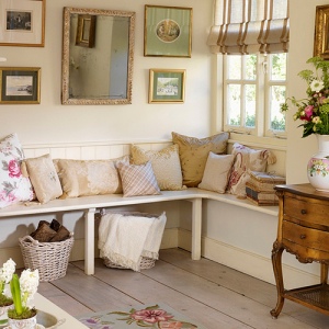
Floorboards

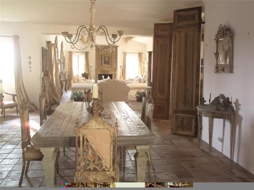
If flagstones aren’t your thing, floorboards can add the patina of age.  Steer away from new floating floors and neat edges and choose recycled wood with marks, dents and a rich colour.

If you want a softer look, you can lime them – this gives them a silvery glow, as though worn smooth by the feet of generations.

Mismatched furniture

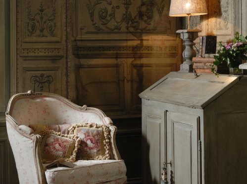
French houses collect furniture through the generations.  Chairs are bought over the centuries and the variety of styles adds to the charm.  This is not a style that calls for a three-piece suite.

Wood kitchen

Baking bread over a fire, arranging flowers from the hedgerow, sipping hot chocolate from a bowl (the french way) – all in a stunning kitchen.  Eschew the stainless steel and formica for natural wood.  Freestanding dressers and pine tables or cabinets built-in local wood create the homely atmosphere for long lazy lunches.

Fill free-standing dressers with sets of old crockery – in french blue or rose and white.

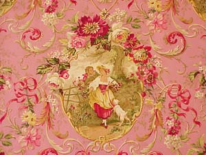
Florals

While chintz may be English, soft florals look so pretty in a french cottage.

french floral fabric

Soft colours

chaise francaise

Keep colours as soft as the light at dawn.  Blush rose pinks, and grey blues, add touches of sage green or a little yellow to give it a lift.  White should be muted too – no harsh pure white here, but a chalky hue.

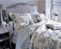
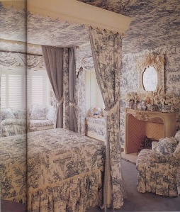
Toile de jouy

Toile de jouy is the ultimate french fabric – its monochomatic palette and timeless design is fabulous in almost any room – and certainly makes this theme sing.  You can cover a whole room in it, or use it for cushions or curtains.  It goes beautifully with a stripe of the same colour.

Old french doors

Many architectural salvage yards now have old doors.  Replacing your doors with a pair of these, or even propping them against a wall will add immediate character to your room.

Zinc and Iron

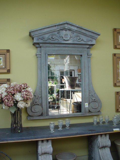
Old zinc and iron furniture really hits the mark with this look.  The more battered the better.  Add urns filled with flowers, old books and hand-blown glass.

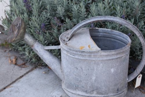
Even if a watering can is all you can afford – it’ll still do the job…

Lastly, pile your home with lavender, rosemary and olive branches – all the beautiful silvery boughs that flourish in the warm sun and sandy soils of France.