Changing seasons: dressing your house for summer Wednesday, Sep 29 2010 

Spring has definitely arrived here in Sydney: Wysteria blossoms tumble over sandstone walls; the sky is burnished to a brilliant blue; the air is warm by mid morning….  And just as I’m throwing off the sweaters and scarves of a particularly cold winter, so a home wants to shake off its winter layers.

I love changing a house by season – it adds such spice to life!  And it doesn’t have to be hard work.

One of the first things I do is to change the curtains in the living room.  For winter I have heavy, glamorous, charcoal drapes, with a sheen that glows by lamp light, and weight that keeps out the evening chill.  For summer, the windows are gauzy with floating muslin, that catches the breeze and softens the light.

I confess that this winter I was even going to make a winter coat for my sofa in a rich silk velvet – but that project just didn’t happen this year….

Summer muslin drapes

The room starts to feel lighter and airier.

Organic linen blinds at window

The window looks simple and quite summery with its linen roman blind, but these large windows need softening, and acres of billowing froth is too lovely to resist.  For curtains like this the secret lies in the quantity not the quality – this type off fabric is not expensive, so make sure there’s oodles of it!  You can do this really cheaply with Ikea’s Lill curtain for only $5.99 a pair!

Changing curtains for summer

The rich velvet pillows and warm cashmere throws are replaced with linen cushions and fresh French toiles. 

Room ready for summer

I even like to swap ornaments and books around – it’s all the fun of having a new home without any of the expense or stress of moving.

Edited and arranged shelving

Moving darker items, wood and leather out, shells, coral and pale-bound books come to the fore.

Summer shelving

Bring in sprays of blossom and new leaves and fill vases full of greenery.  Plant pots of herbs along the kitchen windowsill.

Each change may only seem small, but together they will give a room a very different feel.  You can even roll up rugs for summer (especially if you have an indoor/outdoor area) which has the added benefit of preserving them.

And if you’re reading this in the northern hemisphere, you can, of course, just reverse all of this.  Fill your home with autumn fruits, rich colours and fabrics, layers of rugs and throws.  Although I can’t bear to think of a northern winter in reality….

Please can you vote on the chair trim? Tuesday, Sep 28 2010 

Thanks for all the advice on the chair.  I took it.  And am nearly finished (you can’t see it yet).

I’ve used both the Ralph Lauren linen and the coffee sacks as you all unanimously advised.  And now I’m in a dilemma about the trim….

Where the two fabrics meet are they better left unadorned, or do they look smarter with an antique nail-head trim?  I was sure the trim was going to be the finishing touch, but now I’m not so sure.  I have no idea why I’m so indecisive about this chair!

Recycled grain sack chair without trim

It looks simple without the trim and kind of rustic.  One fabric blends into the next.  Or does it just look unfinished?

Grain sack chair with trim

The trim really neatens it all up, and has a lovely aged character, but…  Is the trim all too much?

Union Jack Box (before and after) Monday, Sep 27 2010 

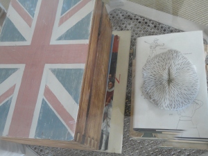
Union Jack Trunk

I have been coveting some Union Jack trunks sold here in Coco Republic.  They retail for $5000.  So coveting is where it’s going to stay.  Until I decided that I could do something similar myself.

I didn’t want something quite on that scale but I love the look of the distressed flag.  So I picked an old, but uninteresting pine box that I had kicking about:

Pine box before recycling

I masked around the top and primed it with a couple of coats of Gesso.  I decided to give this another go rather than using primer.  I quite like the old wood, so I’m going to start by just painting a flag on the top and leaving the sides. 

primed masked box

I decided to paint the flag on freehand.  It was too fiddly to mask it out, and I felt like doing some freehand painting.  So I drew it out first in pencil.

outline of union jack

I mixed up some paint colours that were slightly faded as I didn’t want bright red and blue on here.  Raw Umber is the secret to this – add some and your colours will be nicely faded and old-looking.

painted union jack on box

This still looks far too ‘new’ compared to the coveted trunk, so the next step, once the paint was dry was a good hard sand.

Sanding the top

And even after this much sanding, I kept going…. This is the point at which you need to be brave.  And it paid off:

Union Jack Box after

It looks wonderfully shabby!

distressing detail

This is where using gesso instead of primer made a difference – the sanding back gives a much better effect on the gesso as it comes off with the grain, leaving a lovely distressed effect.

Doesnt cost the earth union jack box

A fab, beachy, cool storage box.  And it was free.  Not $5000.

recycled union jack box

You can fix it – in 30 minutes Friday, Sep 24 2010 

Sometimes you live with something for years before you realise that you can do something about it.

One such case in point for me was this window sill.  A glorious cathedral window covers the stairway, trimmed with one of the most unattractive ‘sills’ you can imagine.  It’s half a lip of ugly aluminium, and then plain render for the rest.  What were they thinking?

Old window sill before

It never actually struck me that I might be able to change this until one night (yes – I renovate at night too!  Hence the photo) the ‘man’ tried to see how it was fixed.

window sill before

He lifted it away in one easy movement – it wasn’t even stuck down!  I mean, his manly, muscular arms rippled as they swept up the old window sill towards his throbbing chest and…. (oh no, that’s supposed to be ME isn’t it?  Not a piece of aluminium )

Anyway, moving right along.  A trip to the wood yard ensued, where I was told severely by a chap (not their usual helpful types) that they only sold timber not wood.  I did find, however, some WOOD that fitted perfectly.  We were going to paint it white to match the other sills, but when we tried it in place, it looks rather fine with just a light oil.

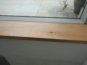
window sill after

It took about thirty minutes to change completely something that had bugged me for years.

window sill after doesn't cost the earth

Is there something bugging you in your house that would only take half an hour to fix?

Orange ideas Wednesday, Sep 22 2010 

It may surprise you to know that I don’t spend ALL my time renovating and redecorating houses – I’m also a keen cook.  And I couldn’t resist posting about this particular recipe as it is so in the spirit of my blog (and most of my life) – no waste.  And it is delicious.

If you have three oranges, you can make your own candied orange peel (great for desserts, cakes, nibbles and coating in chocolate) and scrumptious orange sorbet, without throwing away a thing.

Candied Orange Peel

(I was going to do this as a before and after – with the three whole oranges first…)

Anyway – juice the three oranges and keep the juice in the fridge while you do the peel.  Cut each half of orange peel (remaining flesh intact – that makes it really juicy to eat once it’s been candied) into about three wedges and put in a saucepan with cold water.  Bring to the boil, boil for ten minutes and drain.  Repeat twice, so that you end up boiling them three times, each with fresh cold water, each time for ten minutes.  This removes the bitterness from the peel.

Then weigh the drained peel, and add the same weight in caster sugar.  Put back into the saucepan and stir until the sugar is dissolved and cook, stirring occasionally for an hour or a bit more.  It’s done when the peel starts to go translucent.  You can’t really go wrong.

Drain on a rack (reserving the sugar syrup you drain off) for a day or so and then cut into strips and roll in caster sugar.

doesn't cost the earth candied orange peel

Yum!! This can be put into cakes, biscuits and desserts.  It is delicious eaten as is.  And is superlative when half of each baton is dipped in dark chocolate.

These make perfect gifts.  And as three oranges have made so much my friends shall certainly be benefitting.  Anyone keen for some?

Orange Sorbet

The sugar syrup you drained off – mix with the orange juice in the fridge and stick it in the freezer (yup – it’s as hard as that).  The next day, it will be quite frozen, so cut it into chunks and put it in a blender and blend until smooth.  I like to add a bit of Cointreau or Grand Marnier here – both to enhance the flavour and because the alcohol ensures that it won’t freeze solid.

There you have a zero fat dessert with ingredients of only oranges and sugar – no additives.  And no waste.  You could also make it more creamy at the blending stage by adding a little cream, or coconut cream (if you’re lactose intolerant or fancied a coconut taste). 

 Recycled Oranges

Would you like more recipes now and then?  Would you like some candied orange peel??

Before and after: a garden & the perils of using an architect Monday, Sep 20 2010 

garden beforeOnce upon a time there was a tiny little garden.  This garden was unloved, neglected, and forlorn.  In fact, you could hardly call it a garden: it looks more like a covered area where you’d store your rubbish bins.

This seemed such a momentous issue to solve that we sought the advice of a landscape architect, Peter Glass.  He drew us plans, but the plans he drew were costed at more than $50000 to build (WAY out of our agreed budget).  Things turned pretty nasty (I won’t relive that here…)  I since found out a similar thing happened at a university in Sydney.  Apparently you still have to pay for those plans (even university lawyers couldn’t get out of it) even if they are completely useless to you. 

So if I can save any of you the pain we went through – be very careful.  In Australia at least, you aren’t protected at all in this area as a consumer.

So, by this time we didn’t have any money left.  Nor any useful designs ….so we did it ourselves….  and here are the pics of how we did it.  We got very tired, very muddy and very strong. 

doesnt cost the earth garden

You can see that lattice had been put all over the garden.  This is actually the view from our sitting room!  not very inspiring….

recycling the garden

The first thing we did was to rip down the lattice and remove all the structure beneath.  This was such a joyous exercise for me – I did a little dance every time we tore down another light-restricting, dark, enclosing beam!

ripping out the garden

And suddenly you could see daylight!  And also that there is a big slope.  But plenty of potential.

starting demolition in the garden

As an interim measure I had covered the sleeper wall with bamboo and mirrors to try to improve the outlook from the sitting room.  These all came off, and the sleeper wall was lowered, bit by bit, taking out the soil as we went.

we're getting there

You can see that the soil isn’t that great, but as we excavated, we uncovered more and more of a massive tree stump.

starting the excavation

The access is so bad that you can’t get a stump grinder down. 

(There is a side story here of how we did try to remove it ourselves with a hired chain saw, but after the ‘man’ (or ‘rude name’ as he was called briefly during this incident) sawed through the water main, creating our very own geyser, flooding the house and generally creating pandemonium, we decided not to tackle this ourselves). 

We got a stump whisperer in who removed it with wedges in an hour.  I kid you not.  He must have been at least 70 and he took it out as easily as if it were a sponge cake.

a tree stump issue

We dug out tonnes of soil.  That was the backbreaking and boring bit.  One or two divine and lovely friends pitched in and helped.  And eventually we were ready for the construction phase.

garden design

I decided that as I could design inside, surely I could manage outside too.  So to minimise the feeling of height, I designed three beds, each stepped down.  At first we wondered whether we needed brick walls and concrete foundations.  But keeping the walls to 500mm high eliminates the need for that (and for structural engineers).  So we worked with concrete fibreboard and wooden posts cemented into the ground, 300mm deep.

earth - in the garden

We got new earth and manure to mix in with the old grotty stuff, and ordered plants wholesale as we needed so many of them.  I wanted simple repeating elements (as I like them in my interiors) so we had a line of three Olive Trees as a feature, with rows of Agapanthus backing each bed, and tricolour Jasmine to tumble over the front.

planting the garden

This was such a rewarding stage!  We also painted the new walls and the old sleepers (we left a low front wall of these as they had been so well-built) with the same exterior paint to unify the look.  We chose a colour that picked up the sandstone in the wall behind.

newly planted garden

We only planted this in March of this year.  A few months later (and this is during the Sydney winter) the plants have already settled in and started to grow.

growing garden

The Bougainvillea is in flower:

And the Birds of Paradise have put forth their first bloom – so exotic!

Bird of Paradise

It will be a good year or so before the beds fill out – but as Spring is now officially here – it seemed the right time to share them now….

Once again:

Before…

recycling the garden

After…

growing garden

Before….

doesnt cost the earth garden

After…

planting the garden

Tongue and Grooving Friday, Sep 17 2010 

Well, I’ve been doing a bit of tongue and grooving over here while you weren’t looking.  Uhuh!  Wow – that sounds as if it would be so much more fun.

Although actually it was quite fun.  Just in a different sort of way.  This is the lower half of the wall that I had glazed in this post:

https://doesntcosttheearth.wordpress.com/2010/08/25/colour-wash-wall-before-and-after/

One of the things I consistently love in photos of interiors, is moulding, panelling and wainscoting.  So, inspired by photos, and encouraged by my (architect) sister that you really can just install this in any house regardless of its period, I’m going for it.

I had all the wood cut for me at the wood yard (it was so cheap and quick – far easier than doing it myself, even with my drop saw).  So all that I had to do was slot it together and attach it to the wall. I used Liquid Nails for this.

tongue and groove panelling

At this point in the process I had one of my ‘what the bleep am I doing??” moments.  Usual for me at this point in a project – where I’ve put in a load of work, and because it isn’t finished, it looks terrible.  And then I doubt my vision.  But I’ve learned to plough on and keep faith with myself.  But it doesn’t make it any less awful.

installing tongue and groove panelling

I put nosing along the top and skirting along the bottom.

panelling a wall

I mitred the nosing and skirting into the corners and then masked off my glazed wall (which is virtually impossible to touch up) to protect it before priming.

priming panelling

Boy does it look terrible and cheap and tacky at this point.  I was really gritting my teeth.

nosing on panelling

Once primed you can also see that it doesn’t look good enough where the nosing sits on the tongue and groove (or beadboard as I believe it’s called in the US) – so I got some beading to cover this up. 

beading saves the day

What a great invention beading is!

beadboard panelling

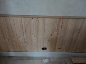
With the nosing and some paint it’s starting to look better.  You can see where I cut out holes to allow the wall plugs to be re-attached.  Phew – feeling better now.  That unpainted pine really looked nasty.

tongue and groove panelling

Now I love the way the panelling looks against the colour washed wall.  It immediately adds character to a house that frankly, has been lacking it!

wood panelling

I’m happy with how the room is progressing.  It’s been a lot of work – but is worth it.

For the final reveal you’ll have to wait: you’ve seen the colour washing, the panelling, the table and chairs – but I have a few more finishing touches to put in place before I can show you the transformation!  Stay tuned!  And keep those comments coming.  They are really encouraging when I hit the mid-project doldrums.

One of the things I’m doing next is going to be to tackle the bland and featureless ceiling…. And see if I can add character without making it look cheesy.  You can be the judge….

Why does paint look different on my wall to the swatch? Tuesday, Sep 14 2010 

One of life’s great mysteries, along with where the odd socks go, is why colour never looks the same on the wall as on the swatch.  How many times have you painted a wall your dream colour only to find that it looks… disappointing?  hideous?  totally not what you thought it would look like?

The worst bit about this, aside from the effort of repainting, is the confusion.  How do you know what is needed to get what you were looking for?

Here are some tips I’ve gleaned along the way that have really helped.

1. Colour is intensified on a wall. 

Much of this is because the area of a paint swatch is tiny – and a wall is many thousand times larger.  So you’ll be seeing many thousand times more of that colour – which alone will make it look stronger.  It’s the different between wearing red nail varnish, and red from head to toe.

If you have a colour you like, go for a dilution – most paint stores can dilute any colour to half or quarter strength.

Alternatively, get a less ‘clean’ version of the colour – a slightly more grey version or a more creamy version (depending on the orientation of your room – see below) can knock the colour back enough to look great.

2. The orientation of the room will change the colour.

Just as the setting sun will burnish everything to a rosy glow, all lights cast their own colours.  Therefore the direction that your windows face will alter the way the colour appears on the walls.  If you face the sun, you will be bathed in warmer light, so yellows will look more yellow, and blues will appear less cold.  If you face the (north in the northern hemisphere, south in Australia – this still confuses me, having been born in Europe) direction that never recieves direct sunlight, cold colours will appear colder, and a yellow will not appear so bright.  I actually painted a warm cream in a room facing the sun and it looked lemon.  In a room that recieves no direct sunlight, I love it!

In this room, you can see how cold the light is, and how fabulous the yellow looks with it.

This means a colour will also look different not only as the day progresses, but also under electric light – and again it depends which bulbs you have: flourescent light is a different shade to tungsten bulbs… 

3. Reflected light changes the colour

Light bounces off surfaces and will alter the shades in your room.  If you have a reddish floor (terracotta tiles, or reddish wood floors), they will cast a red glow on your walls and make reds appear stronger.  They will also bring out the red undertones in other colours such as beige.

Light will also bounce off the things outside the window – if you face a red brick wall, you’ll face the red issue again. 

4. There is no such thing as a ‘neutral’ neutral.

All colours have undertones, even beige.  A beige can have a greenish look, a pinkish look and so on.  And this will be emphasised by the type of sunlight, the reflected light and so on.

The room above looks drab – this is because the walls are a yellowish beige, while the sofa has a pinkish undertone (and the carpet has a purplish beige colour to it).  The cushions have a greenish hue.  This will has the effect of making the room feel slightly ‘off’.  It would be better to replace the wall colour with something different, such as a soft grey and the cushions with a bit of colour – maybe a blue grey to pick up the walls.

The blue below has some yellow in it which warms it a little.

This bathroom is painted a much ‘cooler’ colour. 

6. Personal preferences

Some people just love lots of colour and thrive on it, others find it overwhelming.  Most people tire of strong colour and strong pattern – so that’s fine for an outfit you only wear for a day – but maybe not for a chair that you’re going to sit on for years, day after day, night after night.  If you want strong colour, the cheap and easily-changeable (such as cushions and vases) are my vote.  Wall colour is actually inexpensive to change if you’re doing it yourself, but it is a hassle.

This room (which is actually the office of a colour consultant) would drive me crazy as the yellow and blue on the curtains are so strong, and there seems no respite from the turquoise (which I would love as some gentle accents in the room).

There – much better.  Which goes back to the size issue – when you have a huge area of one colour, it will feel much more overwhelming.

5. Finally, the other items in the room will affect how the colour looks

All colour is relative.   It seems that none are absolute – what is next to one thing can radically alter the way the colour appears (just like red lipstick can make your skin look paler).  But that is such a long story – it will have to wait for another post.

If you want help choosing colours for your home, call me for a consultation on 0424 617755.

A little cabinet: before and after Monday, Sep 13 2010 

Recycled cedar cabinet before

I found this little cedar cabinet at auction and thought it would be useful….  But I’m never that keen on wood that is so strongly coloured.  Cedar is SO red that it can be very dominant in any room, so I thought about toning it down.

Initially I was considering covering the whole piece with silver leaf.  But then I had a play with the leaf, and decided that it would look too shiny.  So I decided to use the silver leaf on the panels and paint the rest white.

Cabinet half way through

I was very careful to mask off all the glass.  As I was painting, I got to the door, and I loved the hinges and the little brass keyhole so much that I thought I’d preserve some of the original wood, and those features.  So I didn’t paint the door.

silver leaf drawer

Silver leafing the panels was another matter.  This was my first attempt on the drawer and I ended up taking it all off and starting again as you can see the left hand side looks rough.  That’s because I put the leaf on when the ‘size’ (special glue to stick down leaf) was still too wet.  I’m telling you this, as taking it off took abuot 3 times as long as putting it on….  Patience is definitely a worthwhile virtue.   So I was more patient next time, and worried less about it drying before I’d got the leaf on, and it went on much more smoothly.

I didn’t want the new and shiny look, so I experimented with raw umber and paynes grey oil colour.  In the end, I put two coats of semi gloss varnish on, to preserve the leaf.  I then rubbed a little undiluted oil colour on, using a soft cloth, until it was the thinned glaze.  I just put it in patches so that it took down the silver newness a notch or two. 

Cabinet after

I gave my lovely paint finish a good hard sand to rough up the edges – fragments of the cedar showing through emphasise its outline and also pick up the untouched door.  Plus I wanted to have a worn and warm look, to reflect its true age.

Antiqued silver leaf panel

You can see below the keyhole I was so keen to preserve – plus you can see that I really did sand it back hard.

Charming keyhole

I really like the patination effect from rubbing the oil colour over.  Raw Umber is brilliant for aging anything.  Except ‘the man’ – I suspect I do a pretty good job at aging him all by myself…

silver leaf

This makes such a perfect drinks cabinet – as you can see all the beautiful bottles and labels.  I had been thinking of using it in my study, but you don’t really want to look at files. 

Silver leaf cabinet after

All that’s missing is a handle for the drawer.  My favourite shop (that really was called Knobs and Knockers) has shut down!  So I’m on the hunt for the right one.  It may take some time but I’ll be sure to show you when it’s done!

Symmetry: the ultimate cure-all for interiors Friday, Sep 10 2010 

Alhambra, Granada

Here’s something to play with this weekend, when you’ve a moment: introduce more symmetry into your home, reunite pairs of objects, and see if you like the result…

More than 1000 years after its construction the Alhambra in Granada still captivates – and one of its biggest hooks is its perfect symmetry.  It has this in multiple planes because of the reflection.   I know that it’s terribly trendy to be asymmetrical, but let’s face it, symmetry trumps it every time.

We’re born to love it: to love it in our faces and those of our animals, in flowers, snowflakes, pine-cones, reflections in lakes.  Almost all beauty has some kind of symmetry.  And this is the easiest fix-it in your home.

Organic symmetry

Symmetry automatically draws the eye.  So if you’re wanting to create a focal point in the room, make it symmetrical.  It doesn’t have to be as exact as in the photo above, but it does need to be balanced.  So a large object (or doorway) on one side, needs something of similar scale on the other.

Symmetrical bed hangings

Here a bed is made sumptuous with a double hanging behind: the symmetry of this double hanging is far more powerful than a single one with this design.  It draws the eye in and is soothing for our brains as it is familiar and recognisable: definitely a feeling you want when you’re going to sleep.

Bedrooms are relatively easy to fix as most of them are already arranged this way with pairs of bedside tables and lamps.

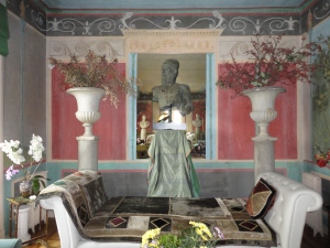
If you have pairs of item in your home that are separated, reunite them!  Pairs of lamps, vases, cushions – make sure they are paired up and not in separate rooms.  The pair of urns below highlight the balance of the classical sofa.  All of the furnishings reference Rome in such a playful way, and Rome was built on symmetry.

doesnt cost the earth symmetry

Anchor your sofa either with urns, or with matching lamps.  If your fireplace is your focal point, enhance it with a balanced and equal arrangement of furniture and art.

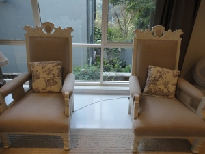
If you have pairs of armchairs, leave them as pairs.  Either identical…

Pair of armchairs

You can see the story of the transformation of these two chairs here: https://doesntcosttheearth.wordpress.com/2010/07/15/heavy-baronial-chairs-get-a-scandinavian-make-over/

Alternatively, you can cover a pair in different fabrics (as below),  or even make a mis-matching pair look similar by using the same fabric.  Either way, it’ll give you a nice equilibrium to the room.

Pair of chairs

Side tables and displays can also look immediately pulled together with a pair of candlesticks, (or almost anything really) – the pair creating a lovely frame.

Symmetrical display

To see how to make these candlesticks click here: https://doesntcosttheearth.wordpress.com/2010/08/11/jute-covered-candlesticks-texture/

Seville

Of course as with everything, there are always exceptions.  And some stunning rooms have been created using asymmetry to create movement and drama.  It’s just that doing that is WAY harder.

Next Page »